I have been unable to figure out how I can make the footer stick to the bottom of the screen even on pages that have little to no content, does anyone know how to accomplish this?
That depends on your general HTML structure.
There are quite a few techniques.
I am just using the Cwicly editor and making changes to the default index page. I do not think that I have made any changes to HTML.
Since there are many possibilities how to put your pages together, as mentioned, it always depends.
Any live site or screenshot of your structure from the browser dev tools?
Oh sorry, you can check the livesite here: https://www.rayastro.com/
on a side note… I cant recall what settings I used to make the menu up top look spaced the way it is
You can try the following approach:
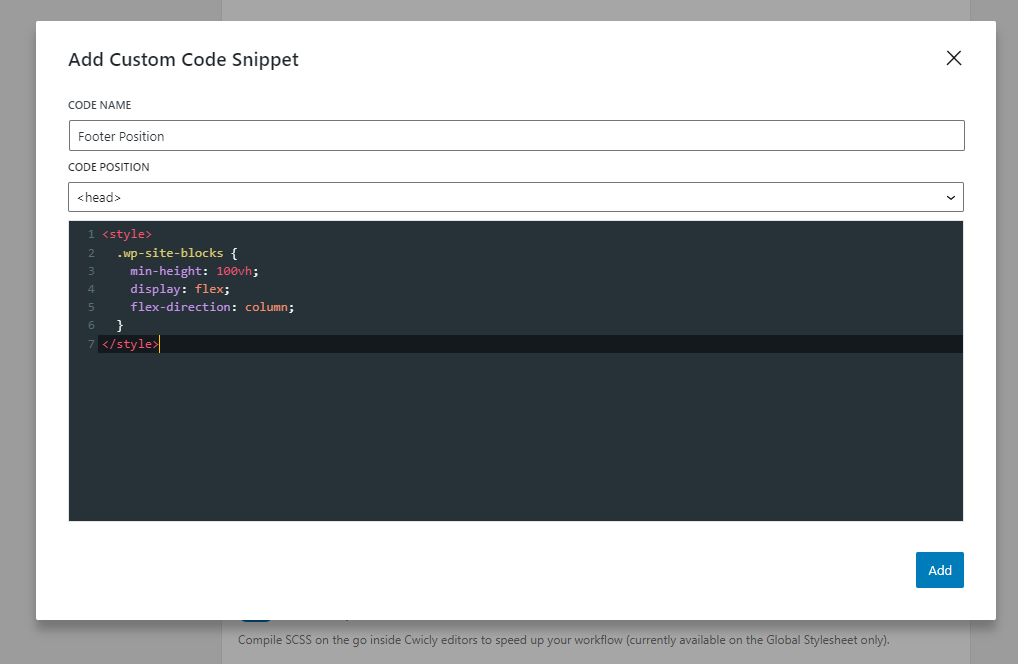
Text form:
<style>
  .wp-site-blocks {
    min-height: 100vh;
    display: flex;
    flex-direction: column;
  }
</style>
Now, you can add either a rule to your section block or your footer block.
Option #1:
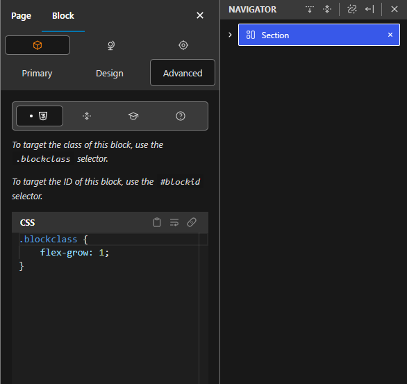
Option #2:
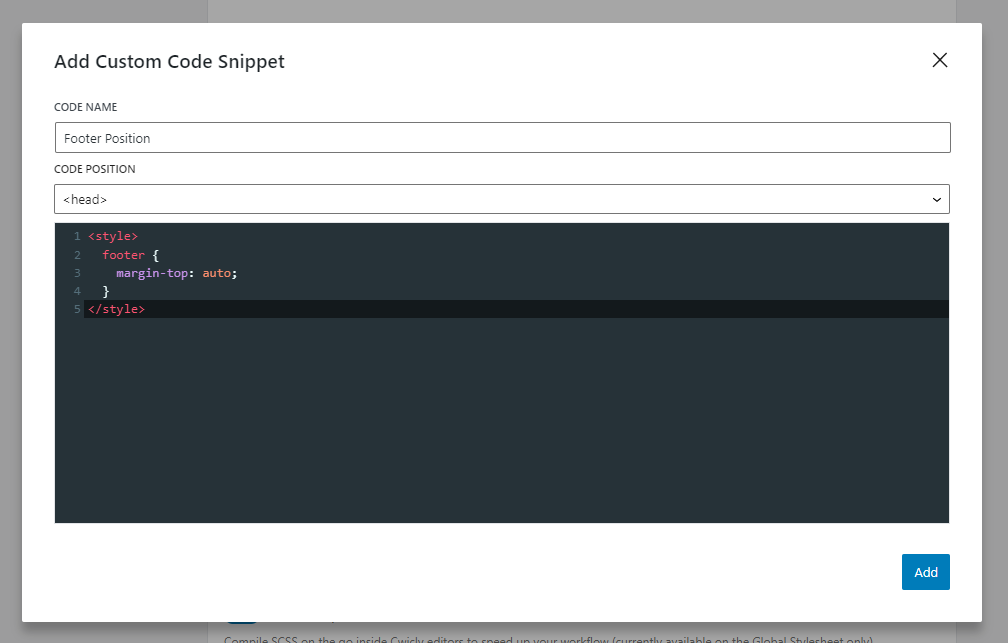
Text form:
<style>
  footer {
    margin-top: auto;
  }
</style>
Let me know if it helps.
Where do I find the custom code snippet box?
Cwicly options in the back-end.
Thank you,
neither option appeared to have any effect.
I think that the menu design is broken… I cannot replicate my header, which I think was done before the recent update of the plugin. Please see the attached gif. I want to space the menu options out, similar to my header. However, the flex space between options and other options appears to do nothing.
Thanks! I had to add it to a section block because the footer block wouldn’t allow me to add the CSS to it. Probably because it is not a cwicly block. Also it did not update in the cwicly view even after saving but the site looks correct when I open it up.
Continuing this thread… When adding the provided code to my site, the footer does get pushed down, but below the browser window due to the 100vh or dvh rules. Any advice how to push the footer to the bottom on pages with little content? Thank you.
This only happens when your content is pushing down the footer.
Could you provide a demo of how you applied the styles to both the post content block and the .wp-site-blocks class?
An exception is when global parts are placed outside the .wp-site-blocks wrapper which depends on your general setup.
Could you please provide a screenshot of your DOM of the frontend then?
You might have to apply the rules differently then (body instead of .wp-site-blocks and .wp-site-blocks instead of the post content block).
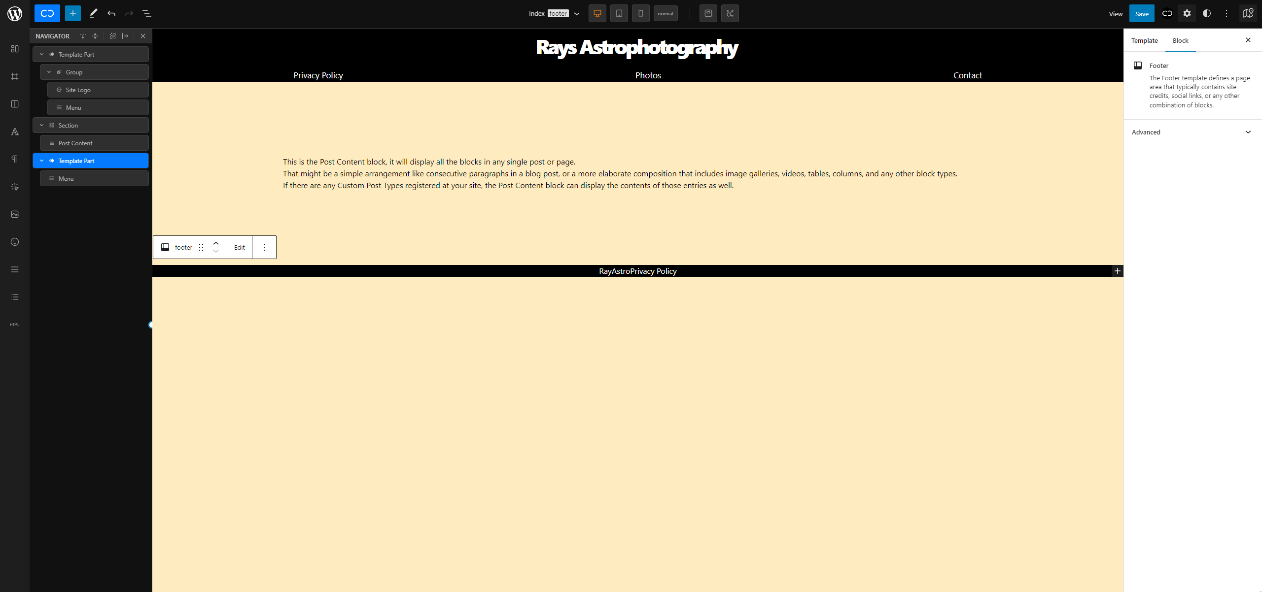
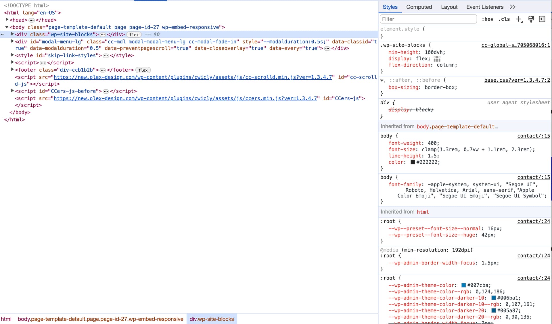
Well, have added the wp-site-blocks as a global style. I have attached a screenshot (DOM) of a page with almost no content.
As for the post content - are you referring to the default post content block - because, no styles are applied to it.
I recommend treating the header like the footer, creating and placing them the same way to have them on the same DOM level.
Currently your header is inside the .wp-site-blocks wrapper, while the footer sits outside.
While this isn’t relevant for your current setup, this is how you would have to apply the flex property to Cwicly’s post content block, if header, post content and footer are all part of the .wp.site-blocks wrapper.
Here is the solution for your current setup, like mentioned above
body {
    min-height: 100dvh;
    display: flex;
    flex-direction: column;
}
.wp-site-blocks {
    flex: 1;
}
Please let me know if that helps.
1 Like
Sorry for the many follow up questions.
- Is it best practices to have the header and footer outside of the .wp-site-blocks?
- How can I move my header outside of the .wp-site-blocks?
- Is the .wp-site-blocks referring to the default “post content” block and should therefore be part of every template?
I was reading in another thread that the .wp-site-blocks can (should?) be tagged as “main” in order to achieve the following structure Header < Main > Footer>?
No worries, that’s what this Discourse is for @Alexander 
Well, I’m fan of a clear structure, like:
<body>
    <header>...</header>
    <main>...</main>
    <footer>...</footer>
</body>
Gutenberg decided to introduce a little intruder here - the .wp-site-blocks wrapper.
Please check this topic for more info in that regard:
Gutenberg $content wrapper - General - Cwicly
Unfortunately, as far as I’m aware, we have no control of where to place the global elements, as they get placed on the root level, like where the .wp-site.blocks wrapper sits.
So, the best solution is to just ignore this wrapper and act like it’s not there.
To answer your question. Since we don’t have a choice, we need to work with what we get.
You should have a consistent approach though.
Like mentioned above,
if you create a footer as a global part, you also should do the same for the header.
Please share your current setup from the Themer if you have issues to follow my advice.
The Post Content block is an independent block and has nothing to do with the .wp.site-blocks wrapper.
It’s always (and only) required if you add content on a page or post level.
This, of course, also depends on your general approach and how you setup your site - also in terms of your template setup in the Themer.
In most cases, it’s recommended to apply the <main> tag to the Post Content block.
As mentioned above, just ignore the .wp-site-blocks.
It’s a meaningless element, DOM structure wise.
No one cares about it from a technical perspective.
1 Like
Hi @rrbailey89,
I’ve found a simple and clean solution for a sticky footer, a while ago at css-tricks.com/a-clever-sticky-footer-technique. One doesn’t have to mess around with flex and similar …
It consists in adding this few lines of CSS as a code snippet or within a global stylesheet:
html, body, .wp-site-blocks { height: 100%;}

body > footer {
  position: sticky;
  top: 100vh;
}
I find it simple, clever and effective … and it just works on all my sites. 
Hey @Marjan.
Thanks for adding this approach here, I wasn’t aware of that.
The problem I see with this, that it requires a specific DOM structure to work.
The provided solution above also requires a specific DOM structure, but depended on the case (which are actually only 2 to choose), it’s easily tweakable via CSS, where the approach you posted can’t be tweaked, since, as mentioned, relies on the actual HTML.
Please let me know your thoughts 