Hi @Louis,
Thanks this improvement!
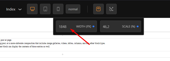
It seems the input is OK now when width is locked, but when it is not, I still have the issue while inputing a number. For instance, 1800 is converted to 1689.
Something is still interfering.
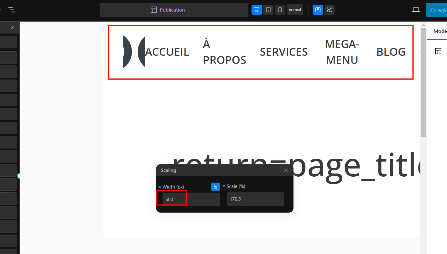
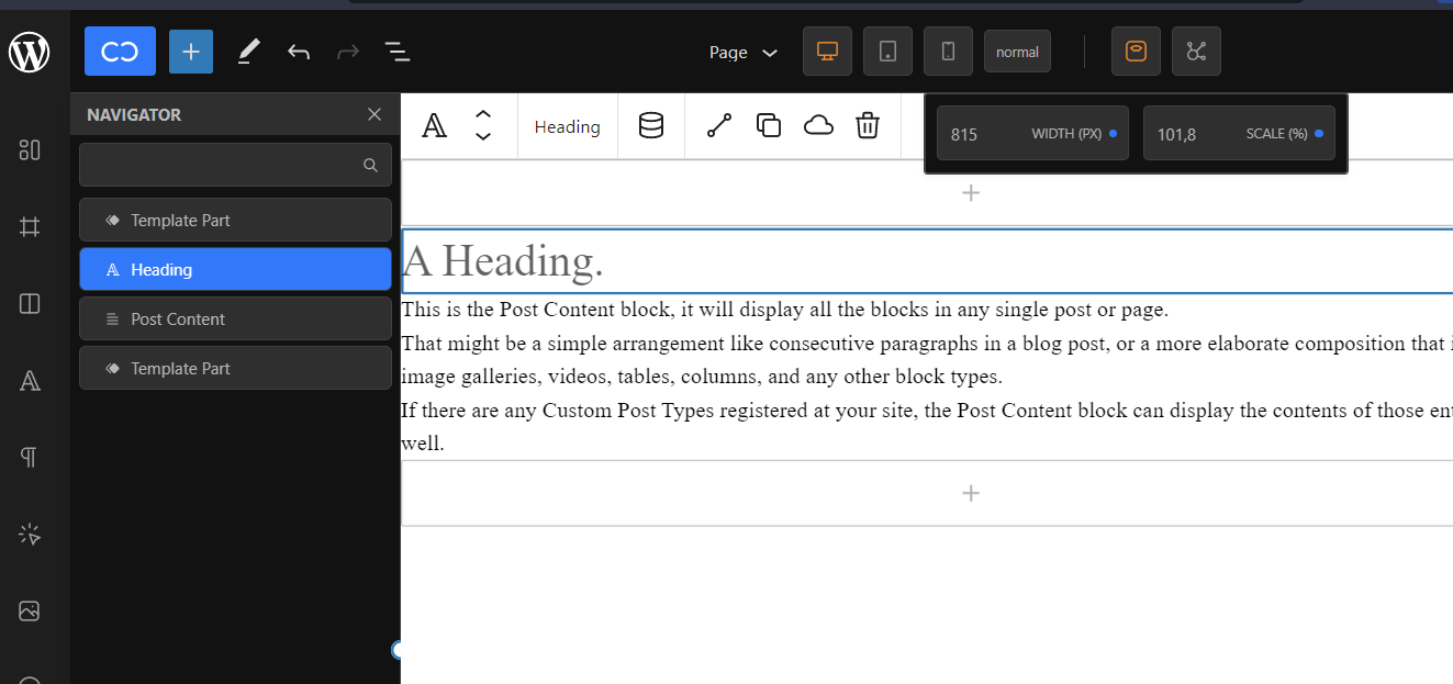
Besides, and this is way more important, it looks like scaling doesn’t handle breakpoints:
Here, at 600px width, middle breakpoint should be activated and mobile menu should appear instead of the desktop one.
I guess a SCALE operation is not enough here, but I don’t know how it is handled in other page editors.
IMHO, the viewport needs to be scaled to match canvas width, but the real width (the one specified in scale input) has to be respected to launch the right CSS breakpoint.
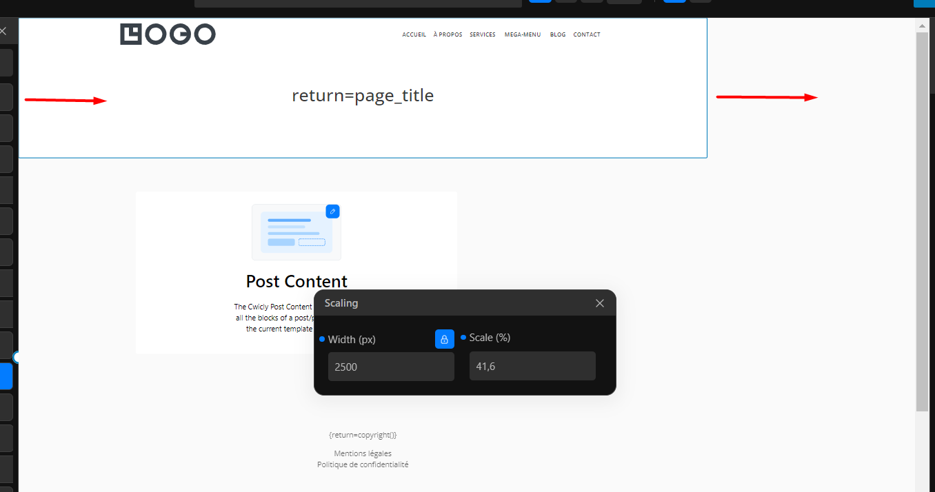
Lastly, I have another issue with this implementation: body element is not centered in canvas, regardless of the width:
And you can see in the first screenshot, with the mobile view, that the body even OVERFLOWS the canvas.
It is due to the fact I always set a max-width and auto margins to my body tag to prevent ridiculous background extensions to the edges of the window on big screens or when zooming out a lot.
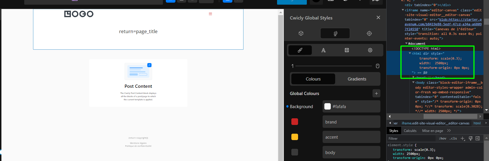
So, instead of scaling body, would it be possible to scale html element?
This would solve the issue:
(Though sometimes I’m not sure whether it is good practice or not to directly alter the body like this and not use an intermediary wrapper, leading to obviously potential conflicts like this one…)
