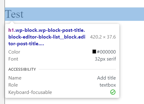
The page title is distracting. I suppose this is a display:none that should be added to a global style sheet? If so, I’m not sure what to use:

I think in general it wouldn’t be the best solution to add visual back-end adjustmens to a global stylesheet, since the CSS would also load on front-end.
Sure, 1 line won’t hurt, but it always starts that way, right? ![]()
They are aware of your point, it recently came up in the Facebook group and this should be addressed in the near future.
To answer your question, yes you could just set a display:none.
Might be the case that you want to target the parent container of the h1 to entirely remove that area - but not certainly sure, I’m not in front of a Cwicly installation right now.
We might have something coming out today that should help with this ![]()
Initial impression after update:
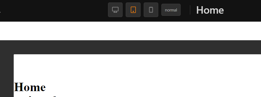
Not quite sure if this is the right position for the post/page title, since it’s kind of interfering with the existing elements - visually wise.
It’s a static element which isn’t touched anymore as soon as the title is set.
I also find the font size too large and it’s missing text-overflow in case the title is too long.
Would love to read other opinions about it.
Thanks for the addition, the canvas looks so much better and its gain of vh height was really needed.
On bigger screen looks ok. The font size should get smaller once you add more text.
On smaller screen it does make the screen-size elements overlap with the “Save draft” part.
Not sure if it’s the right place, but also can’t think of other position as suggestion.
But the important thing (as I mentioned in other posts) is that we do need a way to disable all this additional elements to the interface. This shouldn’t be something clients should see when they add posts or other post types.
I don’t have a strong opinion about where the title should be; it was just in the way where it was (at least for me).
Pinegrow does it like this:
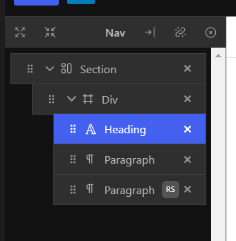
It could go at the top of the Nav maybe:

I’m also not sure where to put it elsewhere.
Maybe a significally reduced font-size would kind of fix it.
Had also same thoughts to put in inside the left top bar area. Maybe directly next to the WP logo but could even look worse / make less sense.
Of course it should be visible at any time and not be hidden behind a toggle, etc.
There are plenty of useless icons in the header and disabling them via preferences will also remove important ones like the preview button or undo/redo.
Maybe there could be some general re-organization with some options introduced what to show/hide.
Hi @Marius,
Thanks for the comments.
The font-size should resize automatically the longer the title gets.
We are also basing the initial font-size on an H1 tag, but I can see your issue with it being too big.
As for the position, I do like to remember that this is the post editor, and a post’s title is primordial in every case.
I’m open to suggestions, and can admit that this might have been a hasty change/modification.
I appreciate you acting as fast as you did.
Hello @alex,
Once the title position/sizing has been improved, would you still prefer to have your users see the Post Title in the post editor itself, as default?
@Louis Yes, I feel that the gutenberg experience for the user should be that as it comes from Wordpress, now and in the long-term, in the post-types we chose to. In a sense that’s what we promise when we sell the idea of going natively.
If the interface is altered consistently, it confuses the user (at least those who are already familiar with the block editor) as if we push them to learn a new page builder. (for a non-technical editor even a slight change in the interface can be a pain)
I feel that gutenberg is going in the right direction for the editing experience for the end user. (for those who currently still cry for the classic editor). And Cwicly is going in the right direction for the designer/developer. But we don’t need to merge this two experiences together.
@alex Thanks for the input!
Those are good points, and ultimately the choice should be left up to you the developer/designer as to what their clients experience with Gutenberg.
We are going to stick with the position of the Post Title, but will be reducing the scaling property to a popover.
Interesting approach, I think this could be a smart decision.
However, it also should be considered that in the future additional breakpoint icons will be added and converting these, for instance, into a dropdown is not what people like to see.
But hey, I also see that nothing in Cwicly is set in stone and since top-bar changes won’t affect workflow muscle memory too much, I’m fine for future improvements as always.
For me, the top-bar is bloated and valuable space is wasted with default Gutenberg elements.
So my question is: Is there a possibility that Cwicly will introduce its own top-bar with the ability to add/remove/re-arrange elements, similar to the quick access bar on the left? Would be another step to a more efficient workflow and exclusive Cwicly experience as well.
Important things just won’t have the space in future and there will be drawbacks when relying on the default bar.
Update after v1.1.7.1:
Significant improvement, I really like it. Thank you for addressing it immediately ![]()

