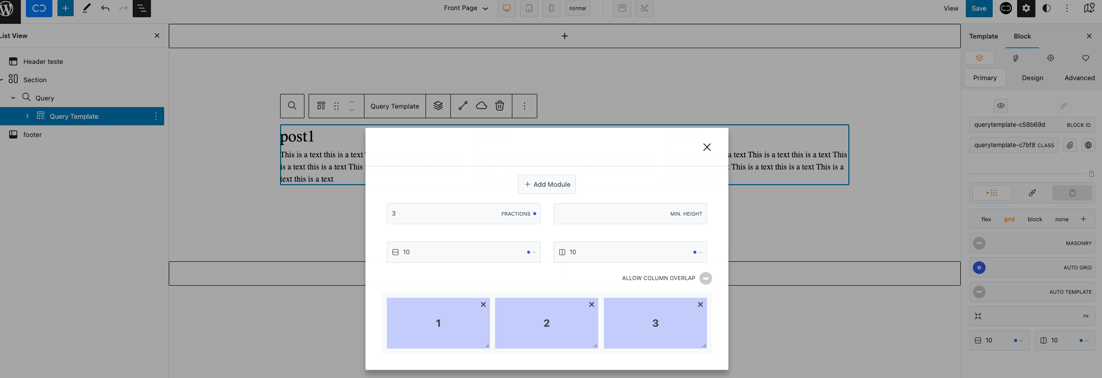
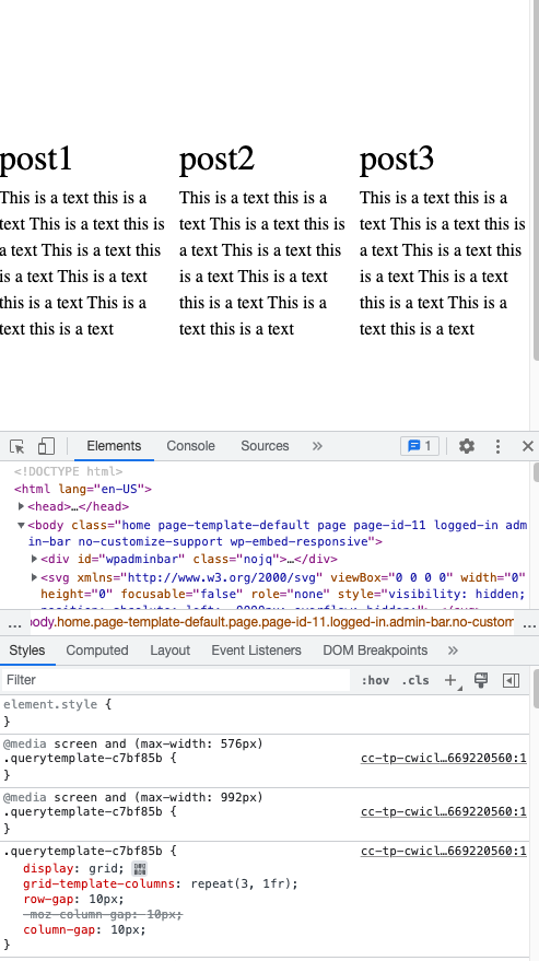
I’m using grid on a query template with 3 columns on desktop and trying to change it to 1 column on tablet and mobile but nothing is happening on tablet and mobile. I get 3 columns on every breakpoint.
I can’t see any code applied to the other breakpoints:
Am I doing something wrong?
Thank you
Hi @picatabibos,
Welcome to the community. 
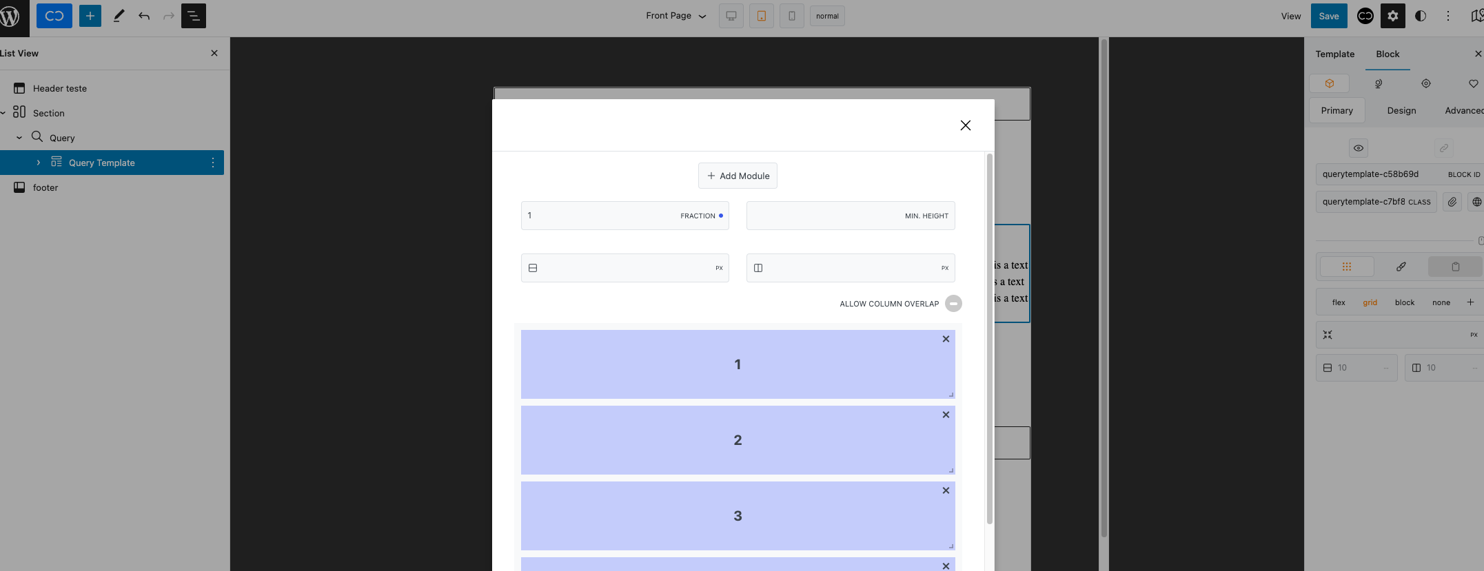
When you have Auto grid toggled on, be sure to only have one row set up (in your case, you need to remove every module except module 1).
Feel free to check out our introduction video on the Columns block that goes over the way the grid display works: Getting Started - Columns Block - Wordpress Gutenberg - YouTube
Please let me know if this helps!
1 Like
Hi @Araminta thanks for your reply. I’m not using the columns layout, I’m using the Query template with grid option selected. Should I add a columns layout inside the Query template?
No, you don’t need to use a Columns block inside the Query template. It was just an example since the Columns and Query template blocks work in the same way when set to grid.
I got it working. Thanks for support! All good now.
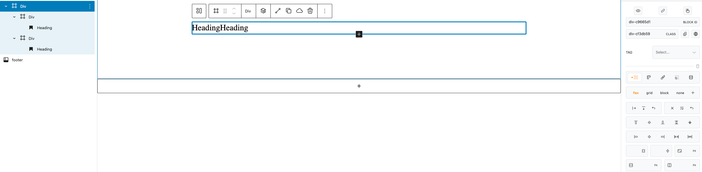
Just one more question related to flex, when I set flex to the container div, the child div’s doesn’t fill all the container width. They should have 50% width each, right?
This is expected behaviour since the div’s children only take up the width they require when the flex-direction value of the parent is set to default, which is row.
If you want them to take up 50% of the width of your div, be sure to set a 100% width to the children.
1 Like