The icon for the grid editor is somehow not intuitive - it is not user friendly.
It kind of reminds me of the paste icon.
Is it possible to change the icon to something that suggests it’s a grid editor?
Maybe something like:
or
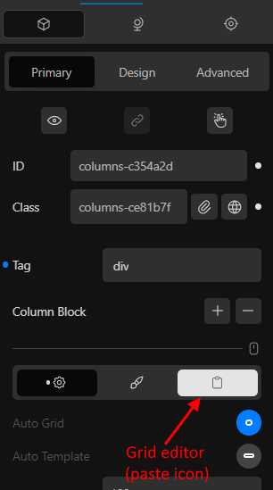
The icon for the grid editor is somehow not intuitive - it is not user friendly.
It kind of reminds me of the paste icon.
Is it possible to change the icon to something that suggests it’s a grid editor?
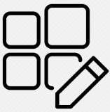
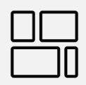
Maybe something like:
or
Hello @antonijo01,
Thanks for pointing this out.
This mirrors the Query editor, but I understand that it might not be best suited.
Definitely something we’ll address soon.
Cheers,