Hi @JulianM,
If I understand your specification, you are wanting to not define a different number of columns per breakpoint, just define the scaling parameters once and have it automatically adjust on different widths.
This is completely doable with CSS grid and completely achievable using Cwicly’s grid builder.
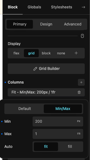
As I showed here, you can edit the columns with three different methods:
If you have a single column and choose “Min/Max”, then “Fit”, this will create the repeat function.
So if I am understanding you correctly, there is no bug and the builder works perfectly and can do what you want.
I hope this clears it up for you.