What I need, its a very simple task.
To create a 2 or maybe 3 column layout that resizes automatically based on a couple of functions, meaning I do not need to adjust the breakpoints one by one.
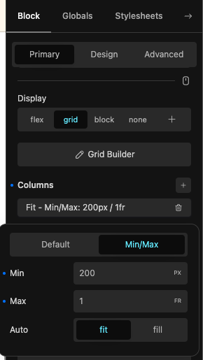
So try it using the grid builder but I can’t get it to work for this simple layout and the documentation does not seems to have the information I need.
The fit-fill space is greyed out ( do not know why) in the columns box and the auto column does not seem to work, since the grid-template-columns seems to overwrite the functions or I don’t know.
The result is simple if I add the functions to the quick editor box for the grid-template-columns line like this, works like a charm:
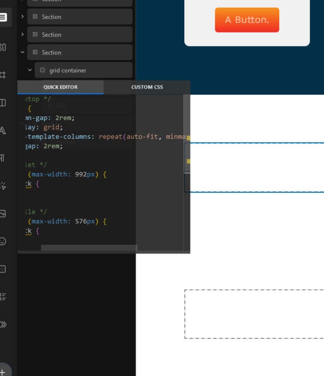
Without having to add an auto-fit line to the code like the builder does, and without using the grid builder columns, not because I don’t want to but because it does not work for me.
Please tell me how it works.
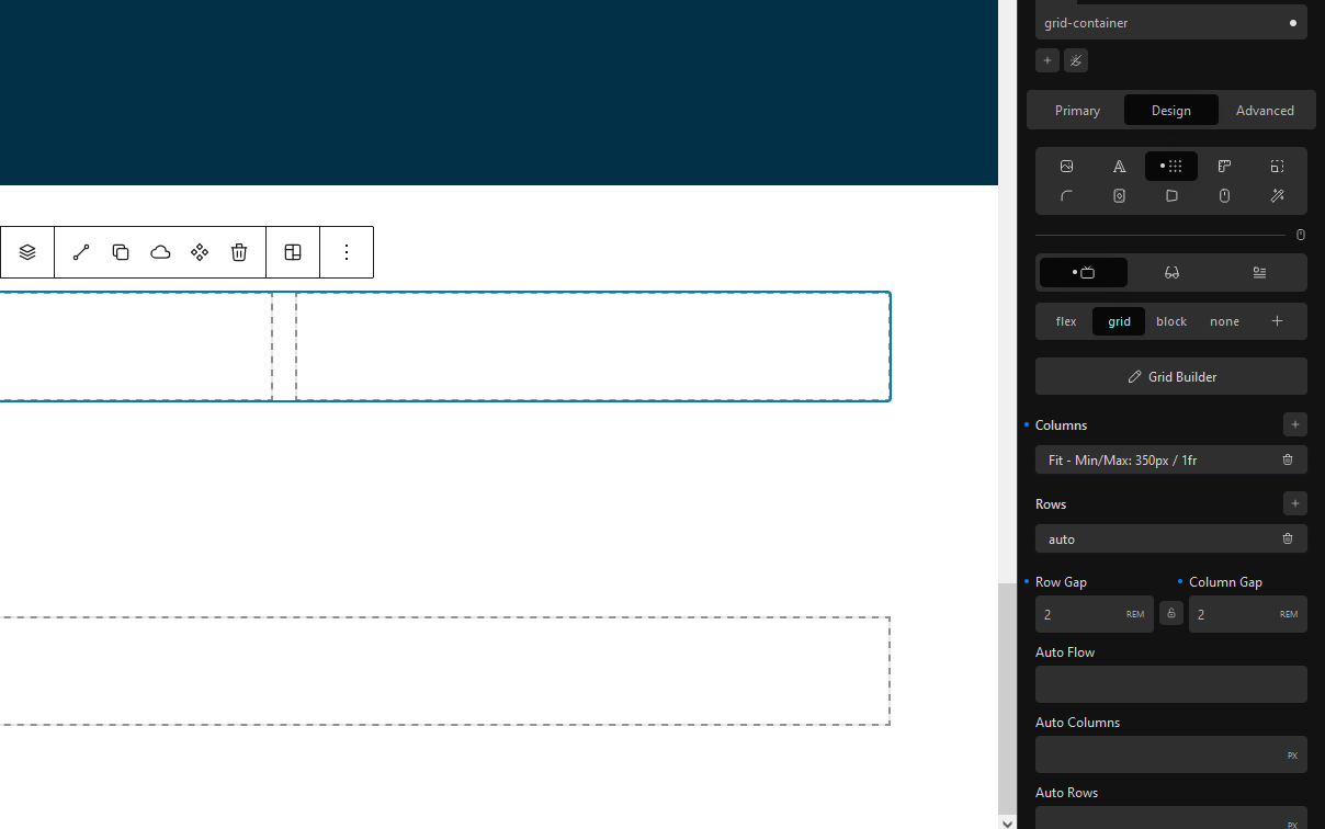
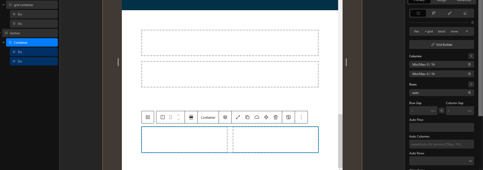
Here the comparison of the results with 2 sections, one using the code over the columns (added from the quick editor) and the other one into the auto columns box.
So, is this a bug? please tell me how to do this better with the GB, without more lines of code.
Does this suggest a possible feature request to add a grid-columns/rows-template box to fill over the columns as well as the auto row and auto columns boxes?
BTW, I am just learning this stuff, I am almost completely ignorant on css grid and I’ve said before how the builder does not help me move through.
Thanks in advance for your reply
Julian