This is a follow on from a few different, ongoing discussions here about how the backend looks and functions, particularly the editor environment for blog posts. It’s an issue because oftentimes, this is where the non-technical users operate.
I want to create as clean and unobtrusive an experience as possible, that feels like using a word processor.
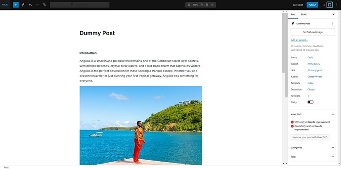
My current issue is that after considerable tweaking within the Role Editor and adding custom CSS, I am able to get my back end looking close to stock factory issue Gutenberg. Only problem is that my user is the only one that looks how I want:
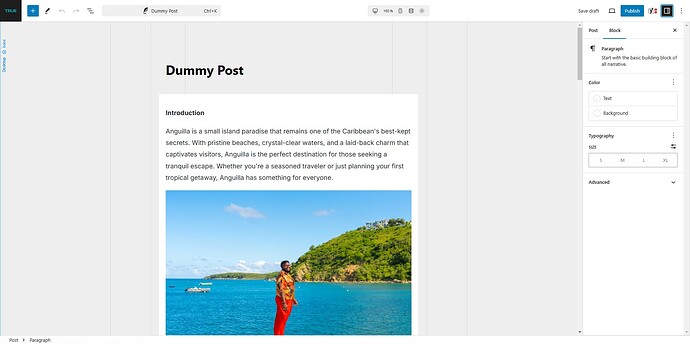
For other users it’s close, but still not quite there, as we are still seeing the breakpoints and the grey canvas background. And I cannot edit the title.
Why is this? I’ve spent a few hours troubleshooting and going back and forth tweaking settings to no avail. Even have another admin account with the same settings in role editor and it looks like this.

