Declutter the Interface - Duplicate Layout Tabs

There is a ‘Layout’ icon in both the ‘Primary’ tab and the ‘Design’ tab.
They serve the same function.

Unless there is some logic I am missing here for the same setting icon to be available in two adjacent tabs, one of them must be done away with.
Either keep the ‘Layout’ in the ‘Primary’ tab, or the ‘Design’ tab.

Declutter the interface.

While I am certainly in favour of decluttering, there is a reason for this - for consistency with other blocks and because it is possible to hide the Design tab in settings:

As layout is a primary concern for containers, if the layout icon was only available in the Design tab and that was hidden, the necessary function would be lost in that case. On the other hand, if it was solely in the Primary tab, this would be inconsistent with the rest of the blocks that have layout features in the Design tab. So this would necessitate putting Layout in the Primary tab for all blocks that require it even though it may not necessarily be a primary concern for those blocks.

So while there may potentially be a way to simplify this, it being in two places is purposeful and intentional.

Thanks for laying out the reasoning from your point of view.

Why have the option to turn off the ‘Design’ tab?
Why would anyone want to turn off the ‘Design’ tab?
Does a user, who is an administrator, lose design functionalities when the ‘Design’ tab is turned off?
If the ‘Design’ tab can be turned off, why have it in the first place?

For the purpose of simplifying (or decluttering) the interface for non-technical editors.

If you know that your clients are unlikely to use any of the features in it or you want to specifically prevent them from doing so for any reason.

You can configure this on a per user or per role basis, so for anyone you do this for, they will lose access to the Design tab and therefore anything solely in there is no longer accessible for them.

Some possible answers to this:

  1. To streamline the user flow (most used / primary features are included in the Primary tab for quick access)
  2. To group related features in a practical and contextual way that makes it easier to form muscle memory to return to them when they are needed.

The same question could be posed for the Advanced tab “Why have it?” , because not everyone who is using it is advanced and having all features from a single scrollable panel would not necessarily be optimal for many UX reasons.

I have never seen such UI/UX implemented in other builders, for good reason, and I don’t personally get the logic of it.
Anyhow, I shared my POV.
Thanks for sharing your POV.
Cheers.

Hello @Hank,

Thanks for sharing your thoughts.

I don’t have much to add here as @StrangeTech, @Marius and @msguerra74 have put forward arguments in favour of this behaviour, which I share.

Would you prefer us to remove the Display section from the Design tab as another builder has done, requiring you to move back and forward when modifying Layout properties?

Our main goal with Cwicly has always been to reduce mouse drag, layout shift and eye movement, as these are factors that drastically reduce consistency.

Cheers,

3 Likes

Perhaps my point is misunderstood.
Thus I would reiterate it differently.

——————————————————————————————

What is logical?
As an user with the [administrator] role, what must be the UI/UX of the editor for that user?

Consider the example of an Element - Container.

What’s in the [Primary Tab]?
Settings for,

  1. Layout
  2. Sizing
  3. Colors
  4. Margin & Padding

What’s in the [Design Tab]?

  1. Everything in the [Primary Tab] plus settings for other properties.

Thus it follows that the [Primary Tab] is essentially redundant. It houses the same settings as it’s next tab neighbor, the [Design Tab].

It is not the case that when a user clicks any element, the [Primary Tab] opens up by default.
If the [Design tab] or the [Advanced Tab] was selected, then those tabs remain open, even if the user clicks other elements.
The user has to make a concerted effort to navigate to the [Primary Tab] to avail of its limited options for settings.
Then why must the user navigate to the [Primary Tab] in the first place? Why not navigate to the [Design Tab] itself, where a multitude of settings are available?

Thus, it follows, that Instead of 3 tabs, Cwicly should only have two tabs, [Design Tab] and [Advanced Tab]. This is ideal UI/UX for the user with an [Administrator] role.

The elements can change, but the logic remains, thus instead of a [Container], it might be a [Heading], or some other Element, but the same settings can be accessed within the [Design Tab].

The [Design Tab] is very well designed and thought out. I am a fan of its UI/UX.

There would be no unnecessary duplication at all. This is logical.

————————————————————————

Role Manager!
I gather from the comments that there is a toggle to disable the [Design Tab] in the Role Manager, and it creates issues.
Instead of granular controls over individual elements, for different roles, Cwicly uses brute force to disable the entire [Design Tab].
This tactic creates the UI/UX issues in the editor of duplication within adjacent tabs, and creation of redundant tabs [Primary Tab].
Editor UI/UX is more important than [Role Manager] functions, and if the [Role Manager] needs tweaks to account for granular controls, then so be it. It’s well worth the effort to tweak it. Easier said than done, but food for thought.

————————————————————————

Cheers.

1 Like

If you view the UI through the perspective of simplification, then that can be considered correct.

If you view the UI through the perspective of speed and efficiency, then that is not necessarily correct.

Similarly, if you view the UI through the perspective of a single type of technical administrative user, then perhaps you can argue that everything content related from the Primary tab could be moved to a new sub tab in the Design tab. It would potentially reduce the user flow by a single click but introduce even more sub tabs into the secondary level.

Doing that would not be an issue with certain blocks (e.g. Paragraphs and Headings) but would be extremely sub optimal for others (e.g. Modal) as you would probably then have to push the options another level deeper thereby adding an additional click.

Lastly it could potentially create inconsistencies in the Design tab layout - currently the design tab follows an easy to understand configuration that is repeatable between blocks - adding a sub tab before that which may or may not be present in some blocks does not help with consistency. At least having these separated logically into the Primary tab means users know that there will be a variable number of tabs in there.

If you view the UI through the perspective of a non-technical editor, the Primary tab becomes very useful indeed, because it reduces cognitive load and shows only the options commonly used by those types of users. Most of our very non-technical clients will only really want to change colours and fonts and text alignment for an individual element, which is covered by the Primary tab. Any more sophisticated requirements can be facilitated through the use of Components.

So while there is duplication, it is purposeful and logical, the goals are just not primarily driven by simplification.

I view it as a way to cleanly separate concerns:
Primary == Functional properties + commonly used styles [changes on a per block basis]
Design == All block styling [is mostly consistent across blocks]

I think no matter how much back and forth discussion there is, we will only be able to come to a consensus when we can agree there is more to creating a usable UI than just simplicity (i.e. speed and efficiency).

There is no duplication in Elementor, or Bricks, or Breakdance, or Oxygen, or Webflow, or any other page builder in the Wordpress ecosystem or outside of it.
Yet, they function fine with a great UI/UX for their users while also fine-tuning their role manager to cater for the clients.

As users, our role is to give feedback to the developers, and then it is up to them to analyse the merits of the feedback, look far and wide, within the Wordpress ecosystem and outside of it, for optimal solutions and implement it to enhance their tool so that their tool can deliver industry standard solutions.

There are many things that Cwicly does that other builders do not, which is one of the reasons we are so grateful it exists! The biggest example of which is the Gutenberg integration, I immediately ruled out many other builders simply because of them lacking in this respect. There are many many examples of other Cwicly features that fall into this category.

Someone using any of those other builders may not see the merits of what Cwicly offers until they hit against one of the inherent limitations or downsides of using them. Finding Cwicly was a huge relief having had to constantly find workarounds and add-ons for other builders, I can say with confidence that Cwicly is very different in that respect and that is a very good thing.

Couldn’t agree more on this point, feedback is key and extremely important.

I see potential in Cwicly, and thus am investing my time in giving feedback that might make Cwicly a formidable page builder.

But if all the time I keep saying ,
Cwicly is the best, Cwicly is the best, Cwicly is the best, then I wouldn’t be adding any value to it.

It’s the nature of feedback to be harsh, crude and unpleasant.

This is appreciated by both the community and the team.
The more feedback and especially the more different opinions and insights, the better.

It needs to be considered that this tool is now 2+ years old since it was released.
So, one can be sure it’s not randomly put together.
The current state of Cwicly is also based on community feedback.
It’s formed by regular users. Real users that face issues when building real projects.

Every user has the same vote and “nothing is set in stone”, as @Louis always says.
So yes, please keep sharing your thoughts.
You also might receive feedback which helps you to get a better idea of Cwicly’s concept & vision.

@StrangeTech, who apparently is a Cwicly power user, already shared his perspective with you, which in most parts is general consensus in this community.

Nope, that’s not how the WP community for the most part works. Fortunately.
Your attitude is none of my business. But you might be in the wrong place with it.

Definitely worthwhile and valuable to do this. :+1:

Anyone can see from a cursory skim of the forum that many of us (myself included) who are quick to say positive things about Cwicly when the team does something worth praising and sharing (which granted, happens frequently) are also just as quick to raise issues and give constructive feedback when something can be improved.

I’ll counter that with direct, honest and concise.

Your feedback on my feedback is harsh, crude and unpleasant.

Self-goal.

Cheers.

You are not worth the time people put into your blathering.

It’s obvious that you don’t understand the concept of a community and open debate culture.
There are no signs of following or acknowledging others opinions, you just keep pushing your own points.

Or your motive ist just something else.
Keep in mind that kindness and patience isn’t infinite.
Good luck with your attitude.

Your attacks on me say more about you than they do about me.
You don’t have good arguments, and thus all you can do is attack me on a personal level.

I am not here to make friends with you and dance around the campfire singing Kumbaya.

I shared a feedback for the consideration of the developers.
I laid out a reasoned argument in favour of my feedback.
It is up to the developers to consider or reject my feedback.

As far as assigning motives, and threats about about kindness and patience!
Go bully someone else!

I’ve been using cwicly for about 2 months and I have to say that the layout duplication tends to be confusing more than helping for a beginner, each time I need all the features below the design tab but I find myself going through one tab or the other without understanding the reason for that. I am not an experienced user of “professional builders” like oxygen or bricks, but I am here running away from builders like elementor, thrive , divi or even breakdance, that’s why I would not compare those to cwicly. And with cwicly, I am able to edit my posts DIRECTLY from the editor, not from Gutenberg which is for me a godsend. Adding a request to disable the primary tab as well as the design tab would make more sense to me since both options are suitable for each user needs.

HI @JulianM,

Please see this brief summation of one way to understand the difference between the two tabs:

Regarding this:

Because the Primary tab contains unique properties not found in the Design tab for many blocks, disabling it would remove the possibility of editing those properties entirely. The only solution in that case would be to merge the two tabs, and in which case the following considerations would come into play:

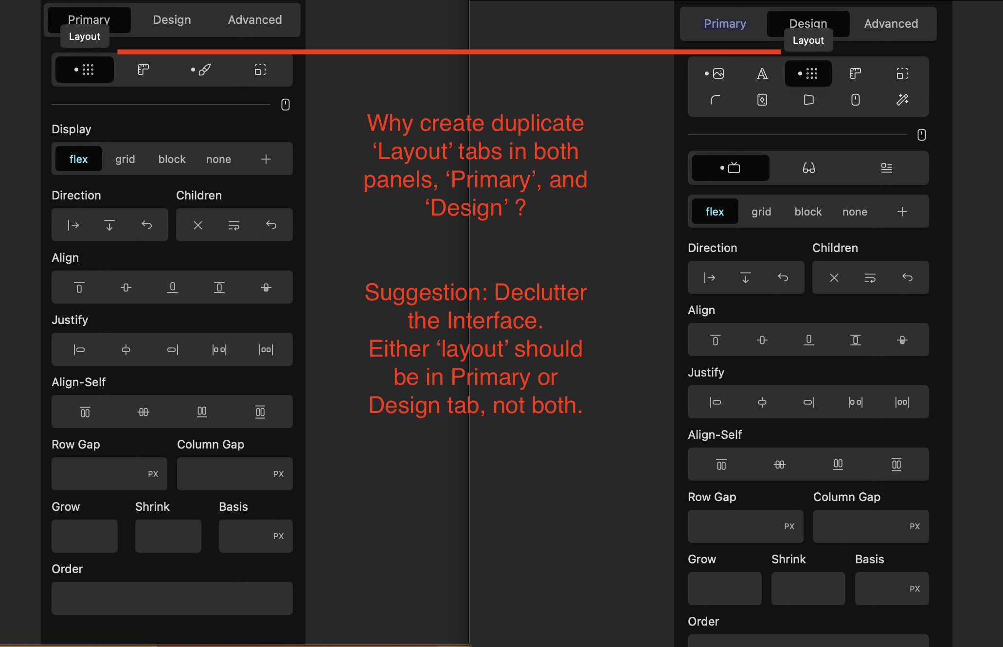
The tailwind update made me take a second look at Cwicly and I will further bolster the reasoning for the feature request, which I reckon is still relevant, and will make a second attempt at persuasion.

Example Element - XYZ
One, Two or Three Tabs
10 settings, from 1-10.
How to arrange them in a logical order?

—————-—————-—————-—————-

Tab A__________ Tab B__________ Tab C
1,2,3___________4,5,6,7__________ 8,9,10

Logical? Yes, it is logical.

—————-—————-—————-—————-

Tab A__________ Tab B__________ Tab C
1,2____________ 3,4,5,6,7,8________9,10

Logical? Yes, it is logical.

—————-—————-—————-—————-

Tab A
1,2,3,4,5,6,7,8,9,10

Logical? Yes, it is logical.

—————-—————-—————-—————-

Tab A___________Tab B
1,2,3,4,5,6,7,8____9,10

Logical? Yes, it is logical.

—————-—————-—————-—————-

Tab A__________ Tab B ____________Tab C
1,2,3,4__________1,2,3,4,5,6,7,8______9,10

Logical? No, it is not logical.
There is unnecessary duplication.
The current state of affairs.

Whatever decision-making process that led to this erroneous outcome should ideally be revisited.

—————-—————-—————-—————-—————-—————-—————-—————-
Modal:
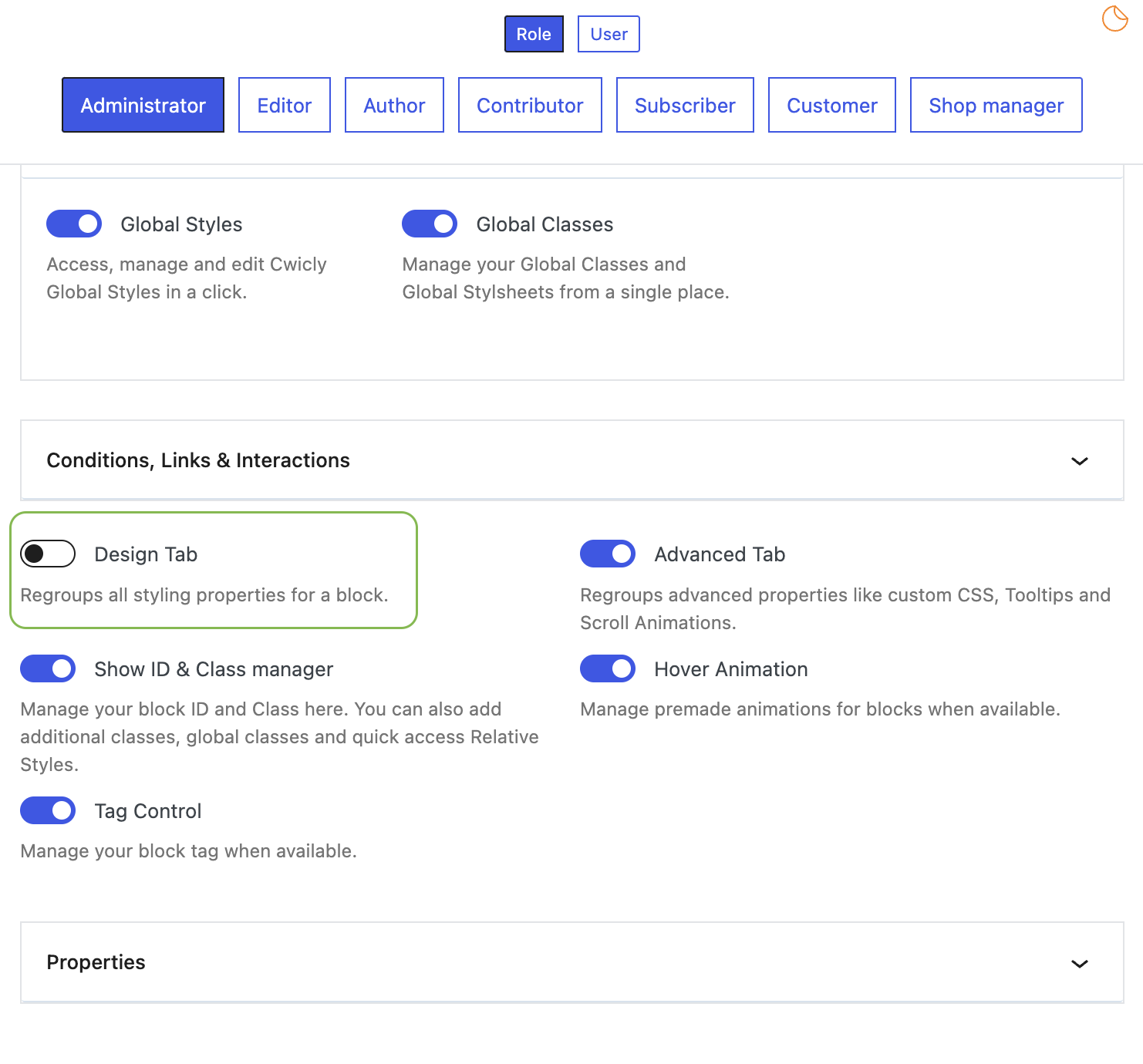
An objection was raised for the Modal Element, and I will address it too.
What are these icons in Cwicly? They open up the settings panel.
These Icons that Cwicly uses are Square in shape, and what Bricks/Elementor uses are rectangular in shape, i.e. they are essentially Accordions.
Square or Rectangle, they both perform the same function, i.e. they open up a settings panel.
For the modal Element, these Icons can be easily transferred to the [Design Tab].

—————-—————-—————-—————-—————-—————-—————-—————-
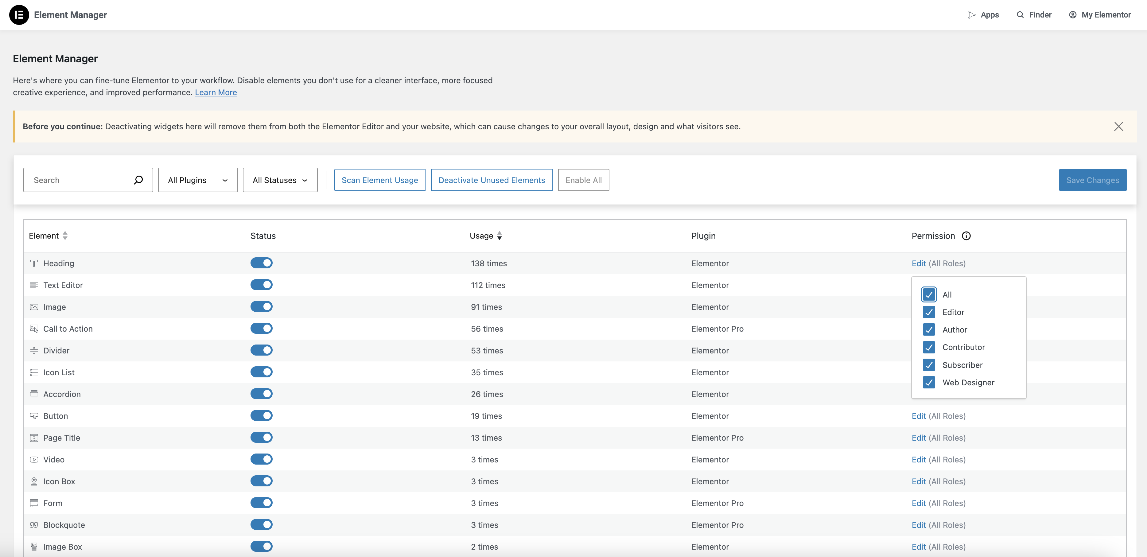
Element Manager and Role Manager:
Coincidentally, Elementor came up with an update recently for the [Role Manager] and the [Element Manager].

The issues raised and the challenges presented with having functionalities for disabling the [Design Tab] can be addressed by having more granular controls like Elementor.

—————-—————-—————-—————-—————-—————-—————-—————-

Clean code output, a Decluttered UI, Tailwind integration, Granular controls for the [Role manager] and [Element Manager], etc will iron out many structural wrinkles and will lay a solid foundation for making Cwicly a formidable challenger in the page builder space and easing the transition of users from other platforms.

Food for thought.