Cwicly - UI/UX Improvements Suggestions

Preface:
Page builders have been very successful in the WordPress ecosystem, and outside of it.
I have been building websites and using page builders since 2017, with Elementor, and more recently with Bricks, and thus, I am sharing feedback on the possible UI/UX improvements for Cwicly, as Cwicly is the first solution within native WordPress that looks very promising, and with the right UI/UX improvements might attract more users like me from the page building world to native Gutenberg environment with a layer of Cwicly on top of it.

Shifting Canvas size:

One of the major pet peeves about Gutenberg is the shift in canvas size when one uses the ‘Block Inserter’ Toggle. The whole layout shifts and it is very jarring, distracting, and annoying.
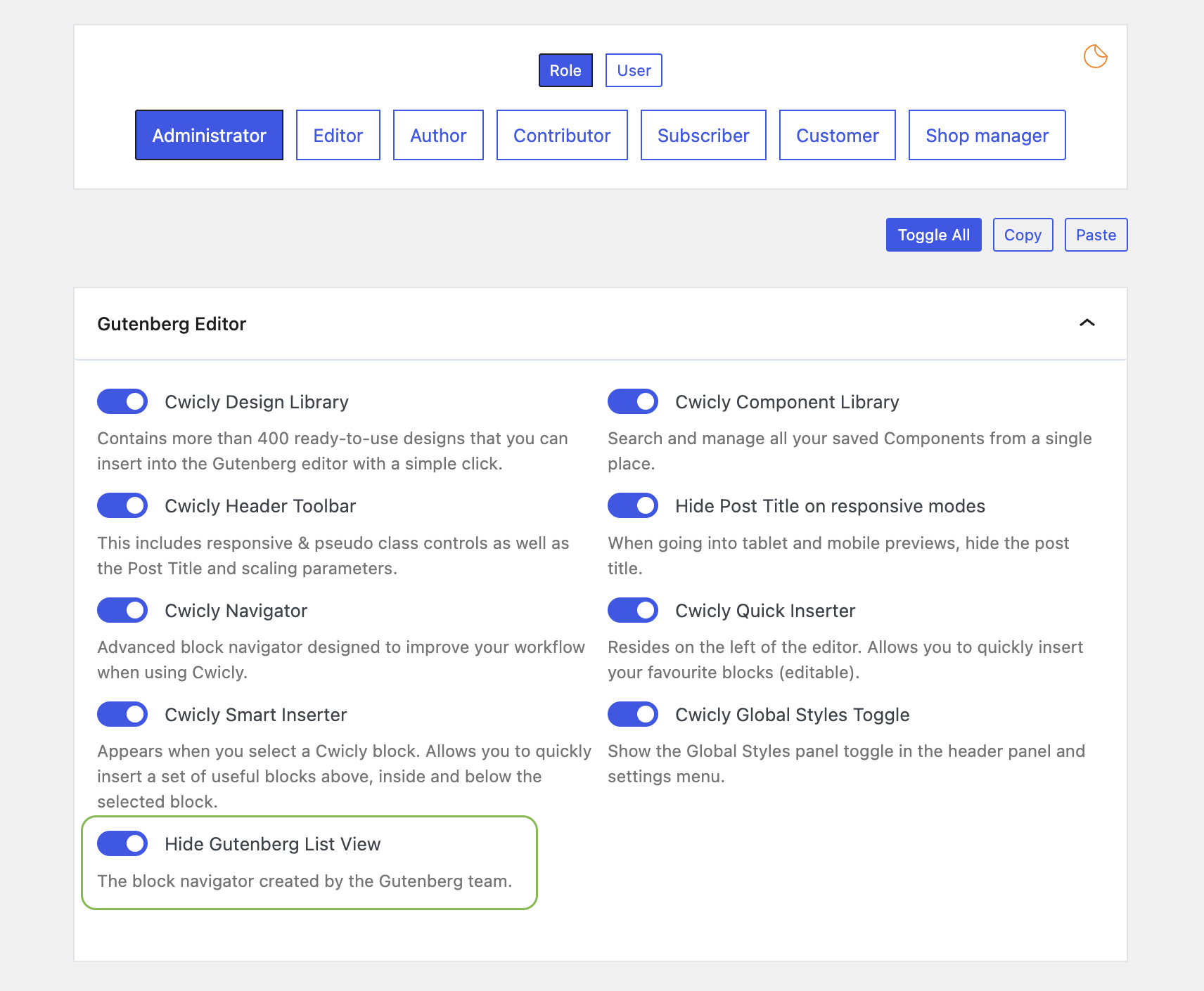
(I realise that there is a smart inserter from Cwicly and a vertical menu bar on the left, but I prefer using the Elements panel, and I suspect it is a common habit with all page builder users).
Unfortunately, the ‘Block Inserter’ Toggle in Gutenberg also opens up panels for Patterns and Media. Thus one has to constantly deal with a shifting canvas.

What is common among all page builders? From the most popular page builder, Elementor, to the newest professional page builder, Bricks, or any other page builder outside of Gutenberg?
The canvas size doesn’t shift. It is a constant. No matter what settings are being toggled or which panels are being used, the canvas doesn’t shift. This is a major plus point. This is how it must be. This is the ideal.

The general layout of any page builder within WordPress is that there are two panels on either side.
One is the Elements/Style panel, and the other is the Structure panel.
It has been a tried and tested UI/UX for almost a decade now and it has widespread market adoption.
There is no need to reinvent the wheel in this sphere.
Webflow uses a variation of this with the style panel on the right and the element panel on the left with a structure panel that doesn’t remain open at all times, a flaw.
Elementor, and especially Bricks, have nailed this UI/UX.

In an Elementor/Bricks editing environment, Elementor/Bricks is fully in charge of UI/UX within the editor.
The same should be true when using Cwicly.
It cannot be that for some things Gutenberg is in charge, while for others Cwicly is in charge, in which case no one is in charge, and it becomes a poor UI/UX for the user.

Suggestion

Cwicly must take over the Gutenberg environment when installed, and perform a few actions on default.

  1. Disable the Gutenberg Structure panel. (Option to turn it back on if a user wants it)
  2. The ‘Block Inserter’ toggle must open an Elements Panel within a new tab of the Style Panel. The Elements tab can house the ‘Block’, ‘Patterns’, and ‘Media’ tab in a sub-tab.
  3. The Style/Elements Panel can be docked on either side, depending on user preference, through a toggle. (similar to the toggle of the structure panel).
  4. The Structure panel can be docked on either side, depending on user preference, through a toggle. (The way it currently does is fantastic).
  5. Canvas, either in the middle or on one side, remains untouched and is impervious to shifts, no matter what elements, patterns, media, toggles, or any other settings a user clicks in the editor. This is a critical point.

Elements Panel (Blocks)

The default UI of the Elements panel (Blocks) and the elements within look very poorly designed when compared to any page builder like Elementor or Bricks.

Suggestion:
I am not sure if this is possible but if it is, Cwicly must consider replicating the clean interface of the Elements panel (Blocks Panel) and the Elements within (Blocks) to mimic the clean interface of Elementor/Bricks.

Summary:
Using the editor must be an enjoyable experience.
Gutenberg introduces many nuisances, and if Cwicly can take over the editor and do away with the Gutenberg nuisances, then building sites on Cwicly would be a more enjoyable experience.

Hope the feedback helps, Cheers.

1 Like

Don’t compare Cwicly with Elementor, Bricks, or any other WordPress page builders. If you need any new features or enhancements, please create a new request. Once it gathers enough votes, @Louis will definitely implement it. You can rearrange the structure panel from settings for more info https://docs.cwicly.com/cwicly/navigator#features. For the elements panel, you can create a new feature request, and I will upvote it.

What’s wrong with comparison?
Everything gets compared to each other.

Amongst phones, an iPhone gets compared to a Samsung, a Huawei, and others.
Amongst cars, Mercedes gets compared to BMW and Audi, and others.
Amongst Cameras, Nikon gets compared to Canon, and Sony and others.

When Elementor came out in 2016-17, it got compared to Visual Composer, and Divi and Beaver Builder.
When Bricks came out, a couple of years back, it got compared to Oxygen and Webflow.

Similarly, Cwicly is going to get compared with other pagebuilders, as people are trying to decide and make up their minds about Cwicly.

Cwicly would have done some things nicely, and there are areas for improvements in others, and that is why I shared a feedback for their consideration.

This is available already via the role editor:

Useful addition for flexibility - I personally prefer it on the right but some users may want to move it.

Hello @Hank,

Thanks for taking the time to jot down these suggestions and improvements.

I believe it is the complete disconnect from WordPress that is a major fault with current page builders. This is easily seen by the growing trend of: convert x blocks into Gutenberg blocks. Users want to have one editor, and that editor is the WordPress editor.

Our role is to empower the WordPress editor to be a publishing tool, a designer tool and developer tool without any of those roles overtaking one another when needed.
There’s lots more to discover and improve - without a doubt - where suggestions on both sides can be of help.

Every addition we make to the Editor these days has to be carefully thought out. The Cwicly/Gutenberg relationship is a precious one :wink:

This is possible through the Role Editor. It isn’t currently enforced by default, but it is open to discussion.

These are valid points and something we can definitely explore in the near future. I do appreciate the worry of a constantly shifting canvas.
For the time being, we have these two features to assist in most cases (I understand your reserves when using them).

I recommend giving this setting a try:


Thanks for bringing this up, @Hank.

Posts like these are valuable as they help us take a larger look at the Editor. Going through your points has brought up some interesting ones for me also. I’ll discuss them with the team but also invite the community to do the same if something in particular wasn’t addressed.

Cheers,

2 Likes

Thanks for taking the time to consider my feedback.
I appreciate it.

Reverse Engineer the Solution - The canvas must not shift and remain steady. (Except for responsive editing).
Any possible path you take to achieve this outcome would be welcome.
It would differentiate Cwicly from all other Gutenberg based solutions whilst also offering its users the same quality of life experience of working with a page builder.

Cheers

Yes, I can aggree lots of things with post’s author.
Cwicly is amazing, but the UI is horrible. Example if I want to add for a div dynamic background, I have to click lot lot lot lot lot of! It is very very slow and annoying solution. On the other hand, If I make a website for a client, how can i teaching him? It will be a nightmare for a simple client, but only change a background image.

Juts an example from documentation for Static image.

  • Select a block.
  • Open the Block Inspector.
  • Navigate to the Design Tab.
  • Open the Background Tab.
  • Open the Source Tab.
  • Find Image.
  • Click to select.
  • Find Source.
  • Select Static.

In Bricks Builder it is only 4 clicks.

Is it? How can it be improved?
Your suggestions must have been lost between all the

lot lot lot lot lot
horrible
very very
slow and annoying
nightmare

But no worries, I got you covered:
Make background source more accessible - Feature Requests - Cwicly

I kindly invite you to add your thoughts there.
Hopefully, we ultimately can escape from this nightmare together :crossed_fingers:

You are that focussed on individual clicks that you lose any relation to where these clicks are required. Yes, clicks should be reduced where possibile, but

Clicks ≠ Clicks.


The answer is Components.
Your client doesn’t need to know anything if you take care of it. It’s up to you to make your clients life easy.


Swinging the wrecking ball without a tiny hint of improvement suggestion is really poor.
If you want to help make things better, just make a little effort, not a rant.

1 Like

I honestly don’t understand what your problem is now.

  • I indicated that (in my opinion) some things on the panel should be reconsidered, because there are a lot of unnecessary clicks to reach many things.

  • But I didn’t just complain, I actually led him step by step with an example.

  • I even gave a counterexample that others solved this much more simply and transparently.

  • Finally, I don’t understand what the client has access to and what he doesn’t. This is how it is for you, and that way for us.

@malaga, I will certainly agree that there are still ways that the Cwicly UI can be adapted for non-technical clients and editors. I have raised a few feature requests about this, some of which have already been included and some of which are planned.

In the meantime, we can make many optimisations for these clients, for example:

  1. Assign them a non-admin user (either a built-in one like Editor, or one you create for them with custom permissions)
  2. Set the default block for their user
  3. Use the Cwicly Role editor to disable certain UI elements
  4. Use the WordPress block selector to restrict which blocks appear for them to use/add
  5. Optionally, use custom CSS to modify the Cwicly UI further

And as @Marius also mentioned, we can use Components to provide a completely curated set of options for them.

There is no such thing as a perfect solution, but Cwicly does give us a very solid starting point.

1 Like

Thank you for your time and your answer.

As I wrote originally. I think Cwicly is a great thing. I was just trying to point out that some things are not sufficiently optimized or thought through, and some tricks could be learned from the competitors on the market, how they solved certain things.

I am aware that there are an incredible number of features that had to be arranged somehow. And those are great features, I’m glad to have them. However, in our market, it is customary for the customer to have a free hand over his site after the handover.
For me, who has been in the business for 10+ years and in the world of wordpress itself, what can I find where, even though I know what I’m looking for, caused some confusion. In some cases, the competitors solved some things better and more logically.
Imagine if I can encounter difficulties with such background and experience, how difficult it will be for a less experienced user. :slight_smile:

Regardless, thanks for your ideas. They can be useful (and I will definitely review them in the next few days!) even if these are not necessarily solutions to the problem I raised (too many clicks and accessing 1-1 functions hidden too deep).