Best illustrated with the video below:
Grid breaks down with variables used for gap
If I use the standard units built in (px, %, em, etc), it works well, but it breaks down if I use my variables.
It displays fine on the front-end, but I imagine in the back-end it’s having trouble grabbing the values from the stylesheet.
While we’re at it, could we add all the unit selections for the gap spacing for galleries as well?
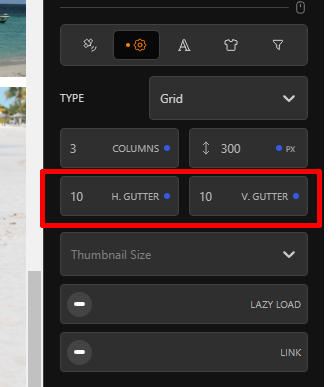
As you can tell, units are a bugbear of mine. I try not to specify any “hard” units for anything on my sites. It’s all variables built on relative units (rem), so we can scale up and down different devices seamlessly, without having to add too many media queries in the CSS.