As components become a more essential part of the Cwicly experience, it’s important that they’re as easy to work with as possible.
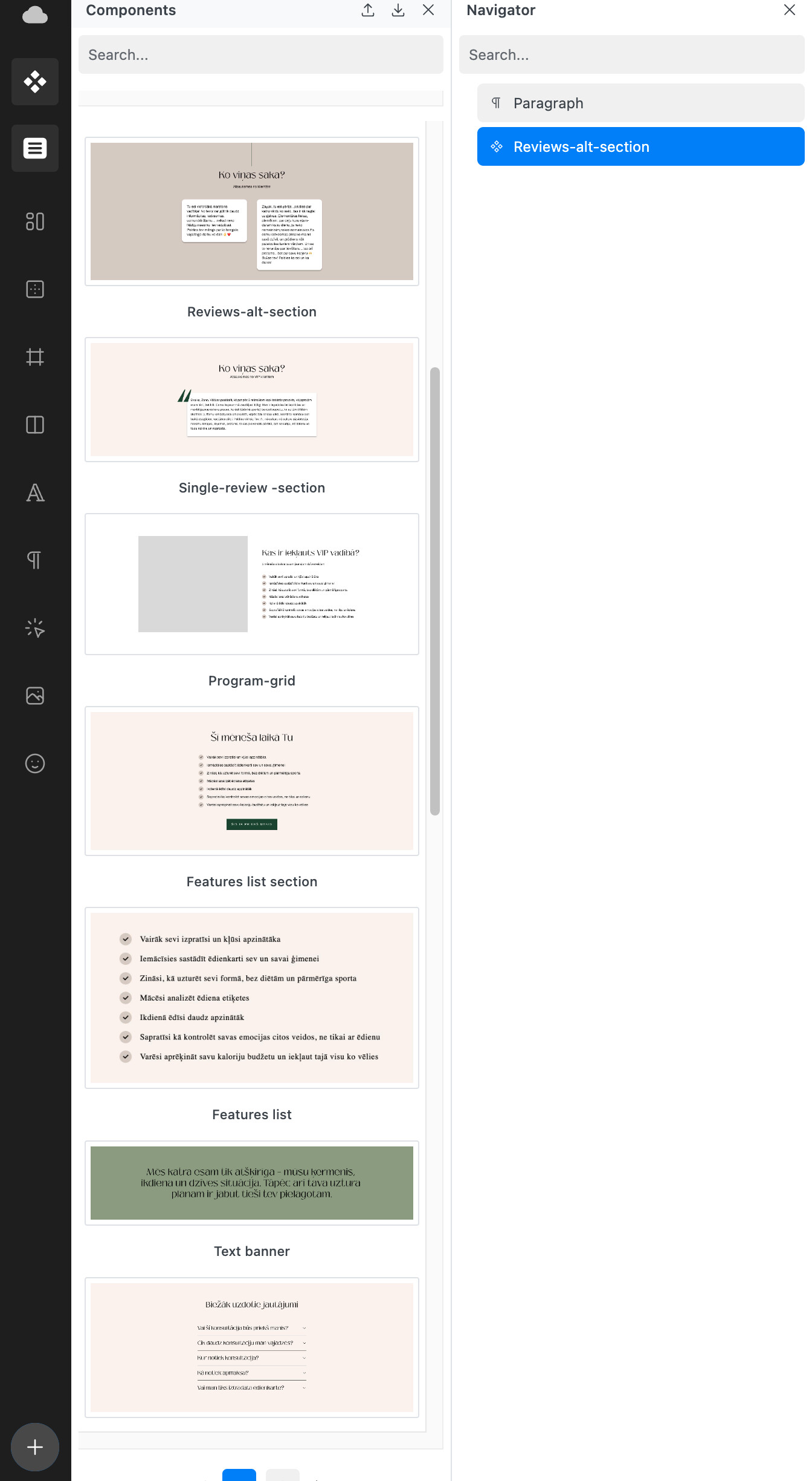
One issue with the current Component Library is that the previews are very small. You have to look at the name to know what you’re inserting.
I get that this is the exact same layout as in Figma, but with Figma you often have a dedicated Components page where you can quickly see everything laid out in 100% size.
My suggestion would be for components to inherit the Design Library view - at least as an option.
(Well, I think the design library also needs to be improved, but you already know my thoughts on that ![]() )
)