Best way to copy paste a section across pages ( keeping virtual classes)

I knew that virtual classes are used inside one page in particular but I was under the assumption that I could copy paste from one page to another and keep a whole section working just fine.

I have my virtual classes renamed : “.removed”
I also noticed I could get it work with a private library and all those are kept just fine.

So my question:

Except for library, and fragments/ template parts (which I believe would achieve it fully)…
What is another simpler way to copy paste a section “identically” from one page to another?

Thank you

I think the library is the only option to keep everything 100% accurately in place.

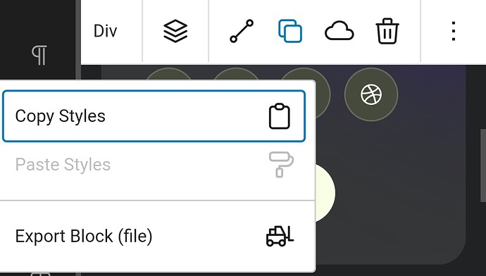
The quickest way is to export blocks via file:

The only downside here is that the block classes get regenerated/replaced.

So I assume you already have figured out everything to consider. Maybe there are other ways I’m not aware of, but I tried everything in the past and the design library provided finally a solution to handle things flawless.

Edit:
Is cross-site copy/paste possible now? I’ve read something that the method has been changed/adapted to Gutenbergs functionality again, using the device clipboard (or something like that, can’t remember exactly).

1 Like

Thank you very much for the prompt answer Marius!
Ouch, I have to say I really wish the processes were easier overall.
While Cwicly offers a lot of flexibility, it is often ending up harder than coding and my fear is that it starts to look a little too opaque.
The constant juggling to understand cascading is painful to me so when another user said it was aimed at beginners… I better not comment further.
Most of the time, I find I would have to use custom CSS nonetheless.

My issue is that nothing is truely centralized:

  • One section/template could need virtual classes to stick, photos to stay attached.
  • I still don’t even see clarity in virtual classes as some did duplicate and hard to track which one was doing what unless opening the devtools.
  • The globals are sometimes attached to classes, sometimes to block elements.
  • Sometimes style is controled via external stylesheet (still not sure if that refers to css box of a block).
  • Sometimes style comes from a relative styling.
  • And yet I love SCSS and I will have to resort to yet another plugin for that.

At first I was in love with all the power, now I start to wish things were more opinionated so as to erase confusion.
Still it feels optimal in a sense but who’s the target market?

I definitely feel the UI needs a global help tooltip mode that you can globally toggle up in the settings.
It would have to be really clear about “WHY” you would use something.
Not just “here’s something for you” but really dive into use case and when not to use.
Example:
You know the virtual class button when you create one?
If global tooltip toggle I mentioned is on (you want tooltips to appear everywhere), then a pretty big tooltip appears telling you:

  • Why virtual class over this and that (url)
  • Use case (url)
  • When not to use (url)
  • See more in the docs (url)

And definitely I would cover the docs much much harder as virtual class is still called its previous name in the documentation, I believe was “additional classes”.

Not to say I am complaining here.
I give fresh newcomer user feedback from a perspective of someone that knows a thing or two about building sites.

10 years ago, I was fine hacking the TinyMCE editor with shortcodes, then things got miserable…
Drag and drops appeared blackboxing everything, bakery builder, then Divi, then Elementor, then Gutenberg bias, now builders for Gutenberg that try to help but are a bigger hustle than code.
I still think this is the best place to be but if I import libraries, they better not be junked with 10 styling methods and no way to “quickly” backtrack its underlying structure.
Even Cwicly own templates have duplicate H1s and weirdness.

Hell that was a long complaint @Louis this could offer some insight as I wish to stay with Cwicly.
I have Bricks but I don’t like non native things, and GenerateBlocks feels a little too simple or not mature enough in its blocks.

Hi there @AnthonyKeller,

There are quite a few approximations and falsehoods.

I will start out saying this:
Cwicly is opinionated in its own way, so this might not be the best fit for you.

First of all, copying/pasting a block to another post/template copies all classes.
The only time you will see the “removed” class is IF you’re pasting a block you have already copied from another page. Cwicly is maybe too smart and removes that class so you will know that something is off.

This will need rephrasing.

See above. As for it being hard to track which one is doing what, this definitely could use some additional visual help with parent highlight (planned)

When have you found this to be the case exactly?

An example would be beneficial, as I’m not aware of this.

Only by choice, not by design. The user chooses to add Relative Styles. In no case will you find Cwicly adding styles with RS by default.

What does SCSS have to do with what you have stated above?

The constant juggling to understand cascading is painful to me so when another user said it was aimed at beginners…

Cascading in visual builders is simple: what is last applies last.

Hey @AnthonyKeller.

I’ve seen that Louis already answered to several of your points.
If you don’t mind, I want to add some thoughts and address some points from the perspective of a regular user.
Maybe there is some additional value for you, well hopefully.

What do you mean with harder?
Do you mean less efficient, like it is less time consuming to write own HTML/CSS?
If so, I can’t agree here. Well, that depends also in how skilled you are in writing.
But if you think so, it’s a tiny trade-off.
A builder gives so much more and, in the end, you’ll save tons of time.

Might be the case, you simply don’t fully understand yet how things are working in the intended way.

I think I mentioned over on Discord that I know some people coming from Elementor who quite enjoy Cwicly and its intuitiveness.
Just to point out that Cwicly isn’t exclusively a tool for advanced users or professionals.
I want to add here that I also know a couple of people coming from Oxygen who have their issues getting warm with it.

And now I’m telling you something else.
Putting the main reasons aside why the following tool can’t fit my requirements and expectations.
I never could get warm with Bricks, while a lot of users find it very intuitive, straight-forward and beginner friendly.

So, what’s the conclusion?
I think it always depends and various factors play a role.

Could you please elaborate on this?

Cwicly is the only builder I know to date, which offers a full no-code approach.
It’s not complete yet, but I would say 98% is already available in terms of CSS properties/values.

Would you mind sharing some specific cases where you feel like you need to write custom rules?

I find this a pretty decent idea, to be honest.
Lots of user questions could be answered instantly and the learning effect will improve, I presume.
At least direct linking to the docs could be something to consider.

I think there was a discussion on Discord as well.
The current designs are exactly built in a way as I would expect as a user and how they build their stuff in the tutorials.
Visually per block basis in combination with the copy linked feature.

The only issue I have with designs I didn’t built by myself - and this became really clear with the new design library - is to find out the parent linking class, but as I can read (and that was already mentioned in a live stream a while ago) this will be addressed at some point:


Why don’t you report the weirdness, it might be the case that most stuff makes sense.
In case h1 duplication is detected, I’m sure there is no problem to address this.

Hope I could help a bit out with my thoughts on this.
Dear Louis and Marius, thank you very much for taking the time to answer in depth and showing interest :slight_smile: Much appreciated.
I will first answer to Louis comments for clarity sake.

In this case that was not my experience. I will have to check a few scenarios to make sure.
Maybe I am working from localhost (MAMP pro) who knows what else that could be.
At least I can tell my font colors and sizes as well as images were not carried over to other page. I did a page to page test.
I was starting from a Cwicly made template simple section in this test. Again needs further testing I guess. If all should have ported, I will definitely update you on that soon with my results.

So here, sorry for my english…
This was based from the testing aforementioned. The virtual classes were renamed “removed” and images + text not there as I said above.

This is great to hear! Actually this was a point that had me really feeling strange about if one day I have to explain that to an employee/team member. If myself I couldn’t quickly come up with a simple answer other than: “just have a search”.

Well here I was referring to the separation of Global elements and Global styles which if I am correct are 2 similar ways to potentially replace each other?
Then if an employee inherits a project, how does he know if, say a typography, was styled as a global typo, or a global element, or a global stylesheet? I may be completely off on this one. Please send me to the correct tutorial if it was explained somewhere.
While I’m at it, I haven’t tested “Folder” inside Global stylesheets as the search for the term “folder” returned nothing in documentation page. FYI.

True that is indeed a power of Cwicly I have to say hats off to you on this feature :slight_smile:
Plus I will admit I wasn’t fair as the visual icons are here. Nice one.

It has to do, besides being out of thread topic completely, to complete my point that styles will come in many forms when checking the DOM loaded stylesheets in frontend, and since I like SCSS to… you know it has great benefits right? Well, point being that it is an extra layer in the decision of:
“What do I use to style that element?” Will it be CSS, SCSS plugin, RS, global SS, etc…
I know you won’t like this comment I just wrote but I think other builders have SCSS integrated and that feels like a feature I would love in the global stylesheet.
I am thinking of using Scripts organizer from Dplugins but then it feels overkill and dumb to add this layer.

Sure I totally like your left to right cascading in classes applied. My point was to reiterate on what I said earlier: “what stylesheet is doing what for this element” when there are so many style entry points.

Please understand that those are not true problems, just little things that I could wrap myself to stick to my own system, but if my agency starts using different workflows, I guess things can always be optimized and it may be my role to communicate.

Marius, thanks, I will try to answer as best as I can.

For the matter of present time, my other alternative was to use Dplugins Scripts organizer plugin, combined with Gutenberg ACF plugin from the same brand.
All this is relatively new tools as well but present the ability to create full gutenberg ACF representation in the admin side, and frontend of course.
I can create blocks with their own “SCSS / PHP ACF / JS” logic as separate block elements. Pretty great.
There’s a codepen you like, boom it’s a block.
So right now I am still considering that option.
Obviously Cwicly is awesome and presents great features that are “builder type”.
I also really liked the idea with Cwicly to have a builder with Gut. AND a cool ability to manage cloud library, that is a huge plus for me.
This is why I was trying to ask about the library limits and how to optimize accessibility, wireframing, BEM naming, ultralight CSS root vars (without going utility framework crazy), etc… as a standardization but I understood things were somewhat ideal as they are with a nice default convention.

Couldn’t agree more. I come with my background, my expectations, my very specific needs so I totally get this. No need to hate a great tool if it is simply not suited for one’s needs.

You’re right, it is truly minimal, yet I thought some properties such as transform origin, that can have double or triple different values… example: transform-origin: bottom right 60px; but then it’s a little css and nothing to cry about, Cwicly provides just fine. :slight_smile:

Great.

Yes, looks like Louis said it will happen. I haven’t seen the live stream or got it then.

Sure did! Thanks man.

1 Like

Hey @AnthonyKeller,

You definitely have some good points here about the global styling.
We’ll be reviewing the panel in the coming months to address every type of scenario since this is something users seem to want.

This has been available for quite some time in Cwicly.

This can definitely be improved on.
I think @Marius shared this on a previous post, but this was provided in 1.2.

I recommend you try things out :slight_smile: This is already possible directly within the transform-origin field.

1 Like