Hi,
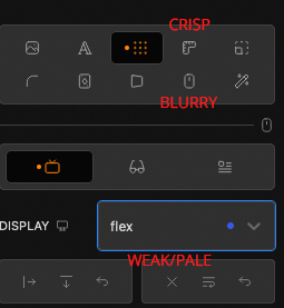
I haven’t worked in Cwicly for a while and today I see the UI / UX changes. Basically I think it’s very well done and it looks classy, but my problem is that I have trouble really capturing the icons.
Depending on the angle of the lines, the antialiasing has a very strong effect and makes the contrast even worse (of course, this varies depending on the monitor used, its resolution and distance to the eyes).
Here is a screenshot (in Firefox) with some comments:
It would be great if there was a possibility to adjust the base color of the icons yourself or if you could make them more contrasty in general.
EDIT: Here in the editor the screenshot (PNG) looks a bit more blurred than it was in reality.