Just got confused while understanding the Action Modal.
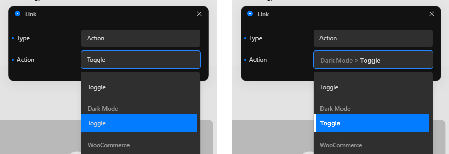
- The current action in the options list is highlighted with the same item’s hover style and gets replaced when scrolling the list.
- More important though is the fact that the labels don’t reflect the folder hierarchy the actions live in.
My suggestions to this:
- Introduce a visual helper in the list which item is currently selected with an outstand text colour and maybe a bar on the left
- Visualize the folder hierarchy in the input to allow for quick scanning