Hey @Louis, thanks a lot for your answer.
I can confirm that the contrast was lacking for me as well, but at the end it all comes down to personal preference so it’s good to hear something like a color manager is at least considered.
Regarding the new UI of the Navigator, it’s great.
After getting used to it a bit, I definitely can say these changes were needed.
Thanks @owynter as well for bringing this up.
Especially the horizontal space savings will help a lot.
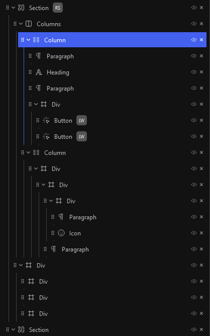
What I would like to see, as now everything is more compact, a visual indication for all children of the selected block (maybe also when hovering the blocks?).
Just an example to make it more clear what I mean, not sure what would be the best way to go: