Responsive preview not working

Description:

I have set a different display on tablet than laptop, but the preview on tablet mode doesn’t show this changes (although it works when i go on a real tablet device)

Screenshots, screen recording, code snippet

  • Cwicly Plugin version: 1.2.9.4.5

Hi @pomilo,

Sorry to hear you’re experiencing trouble with this.

Please take a look at this and see if it helps: Columns block grid editor

Please let me know if this helps!

hi @Araminta this was not an issue with columns but an issue with tablet previewing. For example, i have a section set on display:none for laptop and display:flex for tablet (and vice-versa for an other section), and on the tablet preview, i still see what i have set for laptop, not what i have set for tablet

here is what i see on the editor:

and here is what i am supposed to have:

Unfortunately I haven’t been able to reproduce your issue on my end, as it is working as expected.

Could you possibly provide support@cwicly.com a temporary access so we can take a closer look?

Thank you in advance.

@Araminta just sent you a mail with login and pswd to access my site

1 Like

Thank you @pomilo for the access!

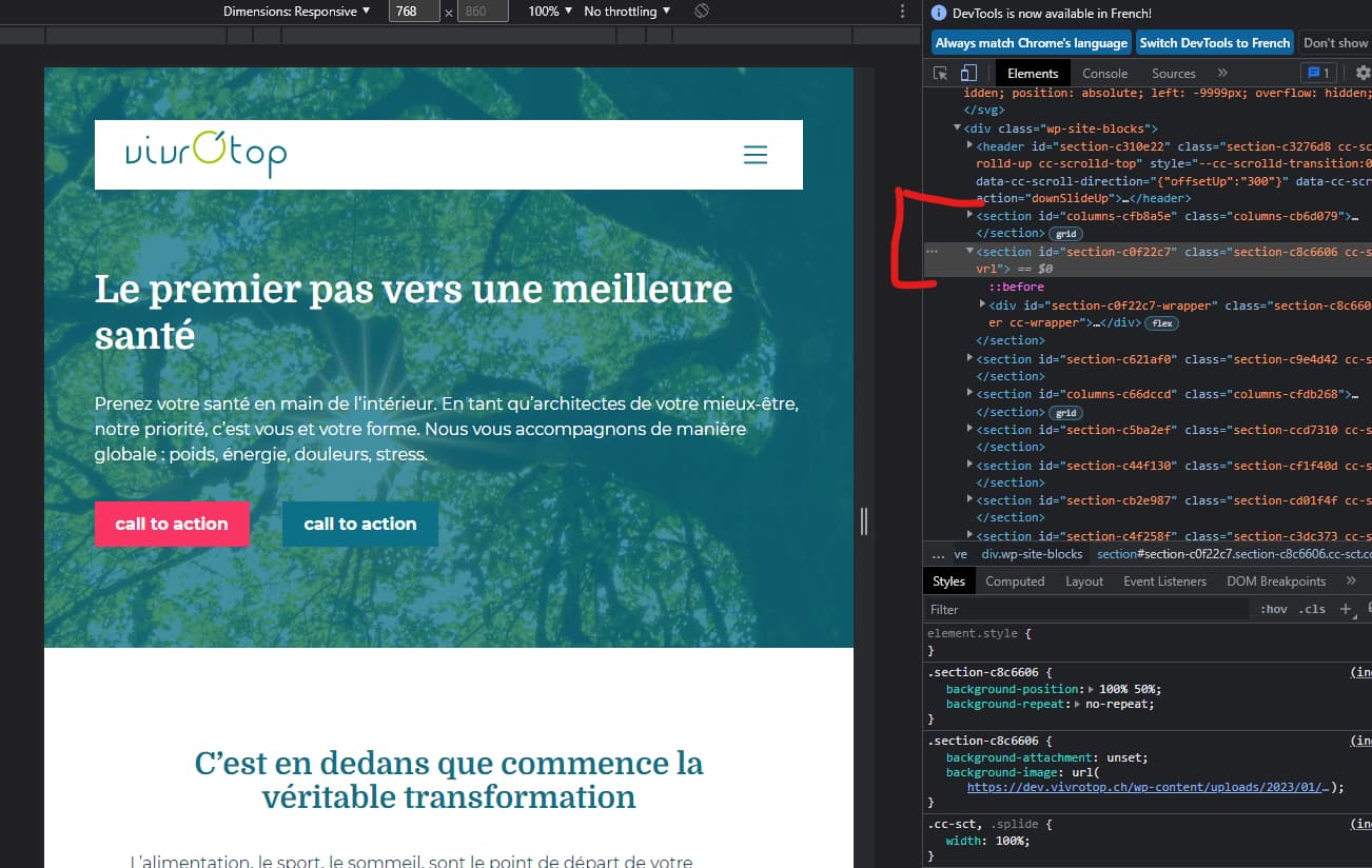
In fact what you are experiencing is caused by the breakpoint you have set for tablet view.

As the Gutenberg tablet view is set to 778px in the editor, if you set your breakpoint to something lower (like you did at 768px) you won’t ever see the changes being applied.

So be sure to set a higher breakpoint to avoid this issue.

Please let me know if this helps!

Moving this to general.

1 Like

@Araminta oh thank you ! i didn’t know there was a breakpoint in gutenberg also ! i’ll set mine at 778px then :wink:

1 Like