Hi,
A few toughts regarding topbar…
1. Direct link to frontend
This is something I’ve requested for all recent builders and I’m always shocked that dev teams still don’t get this right…
PLEASE let us open edited page on frontend with one click only ![]()
Of course devs don’t spend as much time as us webdesigners in the builder, checking frontend back and forth, but it should be obvious that we don’t want additionnal click to open a page on frontend.
And also, don’t open in new tab by default, but let us decide if we want to use CTRL+click or not to do it, for sometimes we want to see frontend AND quit editor.
Besides, the Gutenberg responsive view choices are useless, since we already have responsive controls in the topbar.

2. Structure panel button on the left
I think structure panel switch could be on the left, close to the Guntenberg equivalent button. It would be more consistent.
But maybe it’s because I docked the structure panel left…
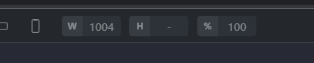
3. Scaling tools in one click
I’m sure scaling inputs could be reduced in width and accessible in one click, like Bricks for instance:
4. Dynamic preview in one click
Maybe the same for dynamic preview, but I’m not sure how to do it and keep it not too wide ![]()
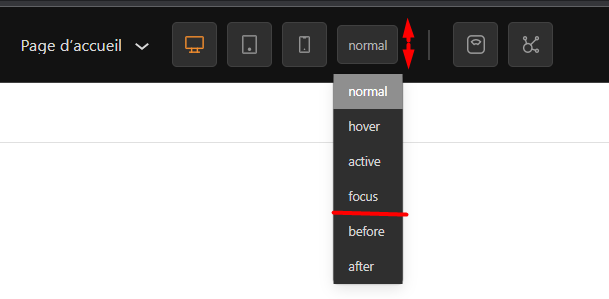
5. Pseudo button/dropdown style
First, make the button the same height as other buttons in topbar.
Then, maybe separate states (pseudo classes) from pseudo elements?
Because they are clearly not the same kind of thing: the first ones represent states, whereas the two last ones represent some additionnal DOM elements.
I would make it 2 distinct dropdowns, but we need at least a noticeable separation if only one.
I would actually make after and before options each available in one click like toggles, but that’s me.
And you would be the first to do it well ![]()