Image size (if srcset is removed or not)

I choose an image (size: 1920 x 1280 px) from media-library. I hit update and look at the front, the image appears. Ok. Now I go back to edit and choose the thumbnail medium size (300 x 200 px). It does not show up in the backend and after update the document it does not show up at front. The source tells me

.../image-300x200.jpg" alt="image" width="1920" height="1280">

Did I something wrong?

2 Likes

Hello @Mario,

I hope I’m understanding this correctly.
Basically, when you change the thumbnail size, you are not seeing those changes applied to the image?

This is because we’ve chosen to use the thumbnail size property as a way of specifying which file size you want to force on a user.
It doesn’t modify the width and height properties (which are applied through the Size tab).
The width and height attributes you see on the img element have no effect on the image itself (unless you remove the css height and width properties), they are solely used to indicate the ratio of the image so that CLS doesn’t occur.
This way, an image can keep its 100% width property and not affect the layout when loading.

Hope this clears things up a little.

Thank you for your answer, Louis. It is still confusing to a new user like me. Below you’ll find my points:


The picture shows the behavior of a WP-image (everyone knows). I choose my custom image size and the dimensions are filled automatic in. No more to do here. The image, which the editor shows, is the one, witch dimensions I choose (480 x 320 px).


Here I also choose my custom image size in the third tab and activate remove SRCSET. But then I need to fill the size by hand in the second tab. The picture shown in the editor is not the one I choose, it is the fullsized version (1920 x 1280 px). Where to enter the caption?

In summary (for me), the first attempt is more intuitive, more streamlined, easier to use.

Hi Louis, this is not very intuitive and not consistent with Gutenberg images.

And the only way to have the right image size is to set it manually?
Because now, image is always 100% width and of course pixelated if a small size is chosen.

There should be at least an option to set the real size automatically, rather than having to look for the size in media library and set it by hand.

Or am I missing something?

I don’t understand this, could you tell us more precisely which use case you are thinking of?
For me, if real size is properly set, layout won’t change at load time anyway.

Sorry I made a mistake, images dont’ have 100% width if CSS width is not set, they have the width set in img’s width attribute (on my laptop they were 100% width because attribute width was larger than my screen):

image

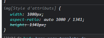
So why not set width and height attributes with the correct values (the one specified by the selected file size)? So that we don’t need to set corresponding CSS width each time?

There’s no point in having a bigger image than selected file size, except in specific cases where you need bigger image and don’t care about quality/blur (like some dim abstract background image), then you can set CSS width to 100% if you will.

I understand this is what is advised in this article:

@Louis any update on this?

It is getting really painful to work with Cwicly’s image block now…
Having to manually set image size every where is not acceptable.

Image width should NEVER be greater than its real physical width by default.

Hello @yankiara,

Can you share a reference that describes this specific rule?

Thanks.

Sorry I don’t understand :wink:
Do you mean a URL with the issue ?
I can reproduce it and share a link in private if you need.

Or maybe you mean this rule?

If so, it seems obvious to me that we don’t want pixelated images by default.

I know that HTML best practices recommand to always set width and height to avoid flicker at image load time, but I think a failsafe with the width associated to selected file size should be added so that we don’t have to systematically “protect” all images.

So we’ll agree this is not a specification :wink: And that the width/height values are more specifically geared towards providing the browser a ratio definition.

But yes, this should be the intended behaviour and will definitely be added.

Well for me ratio is a (useful) bonus, but the real use of width/height attributes is defining displayed image size and reserving the final area (or space) occupied by the image when loaded to avoid content shift.

Exactly my point: the calculated ratio (using width/height) is what is used by the browser to reserve the right space, as the image itself is basically responsive (classes override). The width property in this specific case acts as a max-width.

It does not define the displayed image size (or it wouldn’t be responsive).

Hi @Louis,

Let me punch in again on this rather heavy topic :wink:

  1. We agree that width and height are used by the browser to compute the right area before image is loaded.

  2. But it is also used by the browser to set image size if a CSS width is not set.

  3. And there’s a last thing: WP allows to force a ratio (and crop images accordingly) for image sizes in media settings or when registering custom sizes.

These three points make think that width and height should really be the ones associated to selected size, and not the original full size.

This way, we don’t have to set image width in most cases, because it will be the width of the selected size, and for sizes with different ratio, reserved space will still be correct.

What do you think of this?

NOTE: And in all cases anyway, srcset and sizes attributes will determine the right file to choose.

EDIT: Found additional info here: What width and height attributes should you use with responsive images?: Chip Cullen