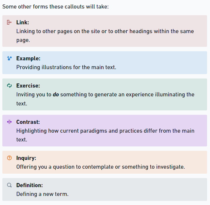
OK, so I am trying to figure out how to create styles for several different types of notification block or call-out to be used throughout a lot of pages and posts. They’ll look something like this (this is in Whimsical, where I’m creating the content):
As I build out the site, including a user manual and lots of other material, I will be inserting hundreds of these. I want to be able to have styles for each type of block so that I can adjust and update as the site grows and the design morphs. I’m guessing they’ll be a column block with two columns inside a div, and I will be able to figure out how to change:
Color
Proportions of the columns
Margins and padding
Size and alignment of the icon
Does anyone have recommendations about how best to proceed with this, perhaps with some pointers to references? It occurs to me I’ll probably need at least one global class for the overall layout of all types of these blocks, and then sub-classes for each different type with their respective colors and icons. I’m just not really sure how to approach the task.
Also, I’m not sure if there is any way to assign a specific icon to a style/class. Is that now, or will that someday be possible?
Thank you for any pointers you can offer. I’ll very much appreciate it.
This should be pretty easy, going the reusable blocks route.
At least, this is my first thought since you always, beside the global styling, need to be able to change the content as well globally - without going through each block manually. Is there any Cwicly solution available I’m not aware of?
It seems, you are on the right path already.
The icon color and background color could be controlled through the parent container with a virtual class (I think this is what you meant with a sub-class) which can be tweaked with the Global Class’ Relative Styling.
Not possible (well, at least not natively in a proper way) but not needed in this case anyway, since you are creating these elements with Reusable Blocks separately, still you gonna use global classes for a clean implementation to avoid unnecessary code.
Use global classes only and stay away from the block classes, these will duplicate indefinitely.
Thank you, @Marius – glad to hear I’m on the right track at least, especially with using global classes.
Yes, I think that’s what I’m anticipating, using the virtual class to assign things like colors. I’ll need to look more closely at the Relative Styling feature to figure out how that works.
Each of these blocks will have unique content. So, unless there is a way to lock some aspects into the Reusable Block while retaining the ability to edit content for each instance, that won’t work. Something like Webflow’s Symbols would be great, enabling setting up a styled div/column/etc and designating content as changeable fields, unique in each instance, while allowing global changes to the container. But I’m not sure Wordpress or Cwicly has that. Do you know?
Everything will be right in place, the only thing you need to do is to paste your content each time.
As soon as the new Cwicly Design Library has been introduced, there will be more convenient ways, I guess.
But it’s not something which should be expected within the next couple of weeks or so.
By golly, Marius, I think you’re right. The Collection feature seems like the way to go. Assign appropriate global classes to the basic structure of each variety of my propagating blocks, save each to the Collection, add new blocks from the Collection and update global classes as needed.
I’ll keep my fingers crossed in the long run for some way to update icons across instances of a Collection block, but if I have to update some icons along the way, that shouldn’t be too excruciating. It’s worth that risk to have the other functionality.
You’re welcome @Joe.
Glad, I could hint you a possible solution for your use case.
In this case I strongly recommend to implement your icons via a pseudo element, for instance the ::before one.
This is not (yet) possible natively with the block options, as far as I am aware.
Just make your SVG icon CSS ready and you should be good to go.
You want to use the background-image property for it, as a value you paste the code from the Ready for CSS box.
Don’t forget to add all the other necessary properties to your pseudo element to make it work.
You could create a global class for the icon, just use the parent container, you don’t even need a separate block:
Wow, thank you @Marius – feels like I’m getting an important education here for what I’m trying to do. Pseudo elements and CSS-ready SVGs are new to me. And yes, I just may reach out to you for further help.