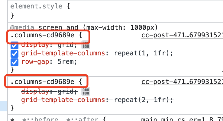
We are building a traditional 50/50 grid layout for Desktop, we need a stack or like a flex direction of column on Tablet. Namely, grid-template-columns: repeat( 2, 1fr ): .
This is repeating workflow to adjust it every time in the Grid Editor, we are trying to get it done by global class, but didn’t get it done.
Seems like Cwicly assign this handle to a random generated class, and just by using media query to achieve this.
You can refer to the attached screenshot.
Is there a chance that we can handle it by global class, and write a single line of css @media to get the job done. Thus we don’t need to bother the Grid Editor again and again for responsive design.
It’s also required to target the individual columns itself .virtualclass[class^="columns"] .cc-clmn
and define the grid rules (rows/columns).
There might be a smart SCSS solution by looping through your columns, or you want to set up individual CSS classes to target/address the values of grid-rows.
Or there is a simpler and more straightforward solution available…
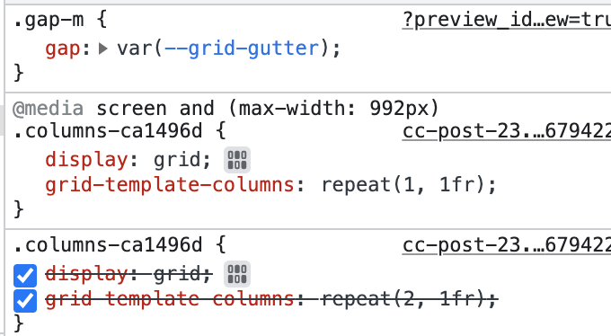
Should I activate the auto gird opiton?
Because I didn’t even touch the Grid Editor of Cwicly for tablet, I just write grid-template-columns: reapeat(1, 1fr); by my own.
But the final css output mess up with the css I write.
I also saw this on Kevin’s Live First Impression of Cwicly.
Just want to know why does that happen? So that I can try to find a solution, not by overriding CSS.
Well it might be wise to either go one way or the other in this situation, but not mix them.
Auto Grid seems to be what you’re looking for, and grid-template-columns: reapeat(1, 1fr); is the exact rule that would be added by Cwicly if you use the Grid editor…
We want to get the responsive grid layout to be based on our own global class, once we achieve it by using the Grid Editor.
Because for now, I can see it applies to the default class that Cwicly generated.
Is that possible to be based on our own global class?