Could be I had this here somewhere posted before, or it was with another environment:
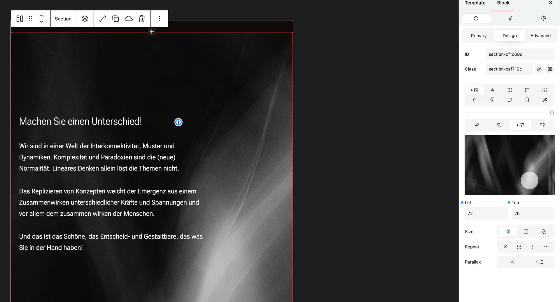
I am using a scaled graphic background image in a hero section, and positioned it differently for desktop, tablet and mobile. It works fine on desktop, and when narrowing the browser view on desktop for the different breakpoints, it is fine too (including safari), and so is on android mobile. But on my iPad it seems to loose the positioning, or even the size settings.
Sorry to hear you’re experiencing trouble with this.
Unfortunately I haven’t been able to reproduce this issue on my end, as when tested on an iPad, the background image positioning and size settings do get applied as expected.
Could you possibly let me know if this is exclusively happening on a template?
Additionally, could you provide me with a frontend link?
Not sure that that is the same, as my issue is already discussed forever on the net, that iOS is struggling with fix parallax of background images. I now remember that I once hat a small css snippet (that really worked) to set fix to scroll for iOS devices, but can’t find it anymore.
I would suggest that Cwicly disables fix parallax for iOS devices by default (so this will keep on working on Android devices), and later, if possible, offers to enable that if there is an solution
So this is not a Cwicly related bug, may should be shifted to feature requests
For the matter of consistency across all devices, you could consider changing the background-attatchment value from fixed to scroll on the first available breakpoint.
But of course, that’s totally up to you. It’s just how I would do it.
Not sure if a dedicated option would make sense here.
But a code snippet could be provided in the docs to address this iOS (Safari) bug.
I’m pretty confident that there will be a parallax option at some point, maybe with the upcoming animator, which would deliver a consistent experience across devices.
I am just going to search for that CSS that changes the fixed parallax for background-attachment to scroll for iOS only, thats a better solution (for me). I already had implemented that some time ago, but can’t remember where and how exactly it looked like.
Maybe that’s a workaround which fits your needs.
It can be implemented natively via the builder as well.
Edit: Here is another resource in english with a similar approach (the one posted above can also be found in the comment section), so others can benefit from this workaround too.
I think this topic can be moved to general, as it’s not related to Cwicly.
Apparently, Apple has no intention to fix this.
Consider to mark this post as the solution to help other users finding an answer to this topic.